


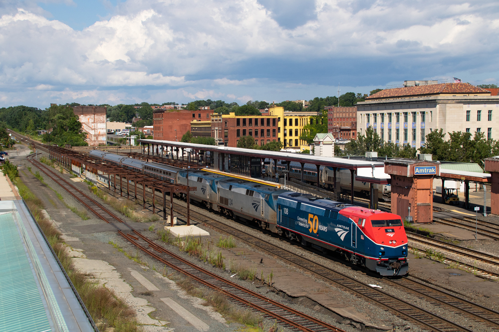
SPRINGFIELD, Mass. — Amtrak P42 No. 108 displays a 50th anniversary version of the interim “Phase VI” paint scheme as it leads the westbound Lake Shore Limited on Friday, July 30. The design is similar to one introduced on the first of the new Siemens ALC42 Charger locomotives [see “Amtrak shows off first long-distance Siemens Charger …,” Trains News Wire, June 15, 2021], but adds a 50th anniversary logo and lacks the red chevron at the rear of the carbody. It is one of six heritage paint schemes now operating or still to come to mark Amtrak’s anniversary [see “Behind Amtrak’s new locomotive designs,” News Wire, March 18, 2021]. Also still to come is the “Phase VII” scheme that will become the new standard design.


Amtrak could use the service of industrial designer Raymond Loewy for new paint schemes of its passenger cars and locomotives. Mr Loewy designed the passenger paint schemes of Southern Railway locomotives in the famous ‘tuxedo’ pattern and Missouri Pacific in columbine blue with grey bands and roofs bordered with silver and yellow stripes. Prior to those projects, he designed the welded car body of the Pennsylvania GG1’s painted in Brunswick green with yellow ‘cat whisker’ stripes.
Raymond Loewy also did the North Coast Limited two-tone green paint scheme for the Northern Pacific.
What strikes me the most in this photo is that more than half the length of high-level Platform C is a skeleton of steel support beams. I thought construction had long since been completed. It was built as MassDOT’s sole contribution to the CT-sponsored Hartford Line commuter/regional service and should have been done and in service for that operation’s startup in 2018. In that year MassDOT was wrapping up the rebuild of the I-91 viaduct that can be easily seen from the west end of all the platforms. That was accomplished with blinding speed, relatively speaking, as was the deployment of the latest incarnation of electronic tolling the entire length of the MassPike that started even as the I-91 project was still underway. When I say “blue, blue, blue” MA with all the pols chest-beating about the perils of climate change/global warming MA is second to none in its modal bias to the fly/drive paradigm for travel, there’s my proof of their hypocrisy. And btw, even if Platform C was complete, the Chicago trains can’t use it because there is no track connection at the west end to/from CSX’s Berkshire Sub.
Mr. Pins, last I knew the locomotive shop at Rensselaer did maintenance on the Downeaster power. So one of the locomotives might be deadheading. In the past, #449’s power did operate all the way to CHI and I suspect still does. Once #49’s dual-mode is out of the way it’s a straightforward move combining the BOS and NY sections being that the latter goes on the head end.
Nice Paint scheme this actually looks good on a P42, they should have got rid of the stupid Phase 5 scheme years ago and either gone with this scheme or another Phase 6 scheme. Still can’t wait for the Pepsi Can Phase 3 Heritage unit to hit the rails.
Do you think those three units can handle those four cars? Seriously, does this power, as is, pick up the NY section and head west, or is there a shuffle in Alb-Ren?
Nice a good change
Veritity is going. Make rail faning more interesting.
Stands out from the current bland scheme, kudos to Amtrak.
I agree, Mark. To get blue and red to go together you need a dark blue and a bright red. They got that right, surprisingly. I always wondered what was so great about the institutional aqua and tired old gray.
Hideous.
I most certainly agree. The gaudy orange and the majestic blue do not go well together at all.
Agree. Same reaction I had when I saw the dome car in its new WMSRR colors.