


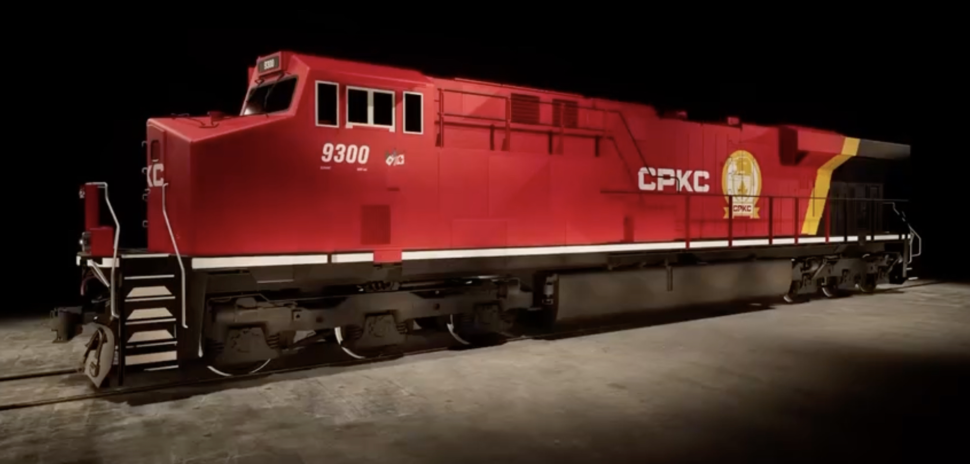
KANSAS CITY — Canadian Pacific Kansas City unveiled its new locomotive livery today after tallying the results of employee voting on five potential designs.
The winning choice — selected by 40% of the more than 5,327 employees who participated in the online survey — was option one. In a separate vote of shareholders at the railway’s investor day today, 40% also chose the same livery, CEO Keith Creel says.
The livery is CP red, features the CPKC beaver and shield logo on the long hood, and ends with a splash of gold and black that begins at the radiator section of the locomotive.
CPKC locomotives will wear the livery in Canada, the U.S., and Mexico.
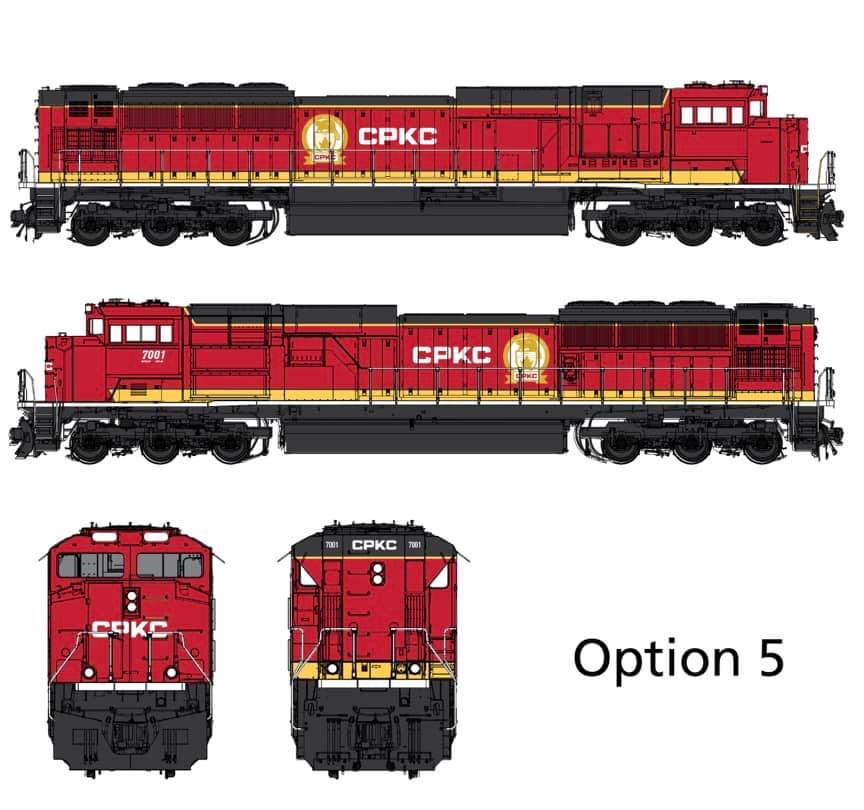
Option No. 5 was second by a wide margin, Creel said.


I still say orange and black with a tilted red rectangle logo would be best.
CPKC is a result of a takeover, not a merger such as Norfolk Southern was. Therefore the name of the railroad should be Canadian Pacific, period.
My thought is that KC was added to the name to appease American share holders and the STB.
But despite my opinions the railroad is the CPKC and I shall eventually get used to it.
And keeping the Beaver Shield, dear to the Canadians hearts, is proof of this. If they really wanted to be transparent, they would show which employees and their former railroad voted for what. It’s kind of humorous that the winning vote couldn’t even get 50%.
It still a CP locomotive with a little splash of color on the part no one looks at. They should do like UP did when they minimized the UP herald like they do with the “Building America” slogan: smaller and to the rear of the locomotive. The Beaver shield continues to shout “Look at me, CP!”
Yuck, that design and paint scheme is ugly! It’s crazy how the larger a railroad becomes the less imaginative its name, logos and paint schemes become.
“The livery is CP red, features the CPKC beaver and shield logo on the long hood”.
The above description is one the side of the locomotive body, no?
The Beavers tail is black. The locomotives tail is black. Ok, now I get it.
“CPKC” … no recognition that the RR goes south of KC … no recognition except for small print of KCS or KCSM … no recognition that it’s a railway! Oh well, KCS and KCSM are the Acquired railroads. Better, I guess, than CNW, SP, MP, DRGW, SSW, that just disappeared into “UP”.
And at least “UP” is the abbreviation for an historic railroad. “CPKC” isn’t an abbreviation for anything, and has about as much panache as “BNSF” or “CSX”. You’d not know that it’s a railroad.
They are letting the CANADIAN BEAVER do the talking. They would have been better off using one Vergara’s proposed design. At least it would have been more honest.
You have it right Daniel, paint doesn’t pull freight. I’d be willing to bet there isn’t a paint scheme in existence that everyone could agree with.
Pretty boring I think. Five was slightly better. About a new logo with a beaver, a black bear and a coyote ?
I remain with Option 2 for the new paint scheme of CPKC. I never liked Canadian Pacific’s 1970s abstract paint scheme with “CP RAIL” logo to imitate Canadian National’s red, white, and black paint scheme with the noodle initials “CN”. [Quite possibly, Cable News Network (CNN) was inspired by Canadian National’s logo to form its own in the same style with a second “N”.]
Yeah but Virtual Railfan video Grab Bags like it every time a CP “Pac-Man” locomotive goes by in its video’s” WACA WACA WACA WACA…. lol…
Personally, I prefer option 5. 3 still looks good though. Might sound a little awkward to some, but I would have rebranded the railroad as CANUSMEX Rail (Canada-United States-Mexico) and had a new logo showing the three countries.
Yeah but Virtual Railfan video Grab Bags like it every time a CP “Pac-Man” locomotive goes by in its video’s” WACA WACA WACA WACA…. lol…
Sorry about that…
Option No. 5 is as alluring as Option No. 1!
Dr. Güntürk Üstün
They should have rebranded; CPKC could be an accountant. Or engineering firm.
ContinentRail would be my suggestion; continent is the same in French. And look, “tRail” is a little hidden Easter Egg in the name.
Ferrocarril Continente in Spanish.
It’s a sign of our times: everyone, even railroads, are too lazy even to attempt the effort to make a statement on the most visible asset they own. Pathetic.
They should have rebranded; CPKC could be an accountant. Or engineering firm.
ContinentRail would be my nod; continent is the same in French. There’s even a hidden branding Easter egg in the name – “tRail”
Ferrocarril Continente in Spanish.
It incorporates the beaver shield and the colors of KCS. Good compromise in incorporating the colors of both major companies. I like it.
What compromise. A splash of yellow is a compromise? They could have put a picture of the Beaver with a shotgun blowing a hole in a billboard with KCS emblazoned on it and it would have been as much of a compromise without any misunderstanding. KCS is history! Why didn’t CP just admit it and get on with life!
Meh.
Remember the CP livery of the late 1960’s and the 1970’s? Never should have been dropped. There’s a bit of that in this new livery. I’m with Anthony Raimondi, it’s a compromise, maybe not the best ever, but I can live with it. CPKC goes through my home town, I’ll be on the lookout.
Hmm. Hadn’t thought of that. A rattle can of Rustoleum white and some masking tape and Pac Man lives again. That said, what was true then is still true today: Paint don’t pull freight. CPKC has A LOT of investment to make to fully leverage their newly minted concession. Still wish them the best of success.