


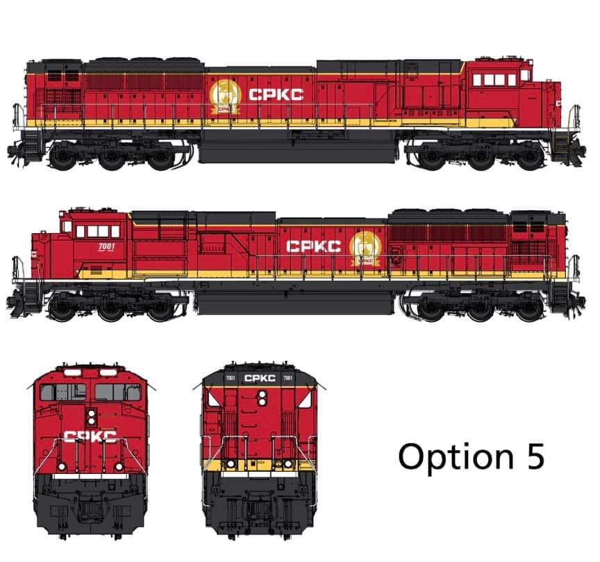
CALGARY, Alberta – CPKC employees will select the railway’s new locomotive livery through an online survey, a company spokesman says.
The SurveyMonkey poll asks the railway’s 20,345 employees to choose one of five proposed paint schemes for CPKC locomotives.
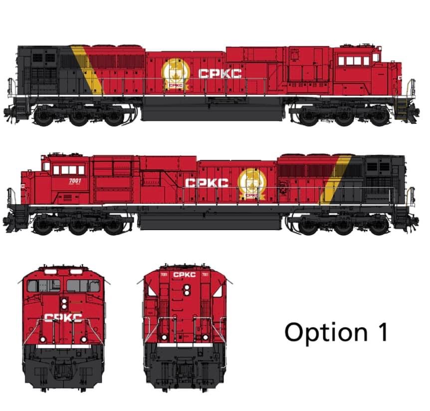
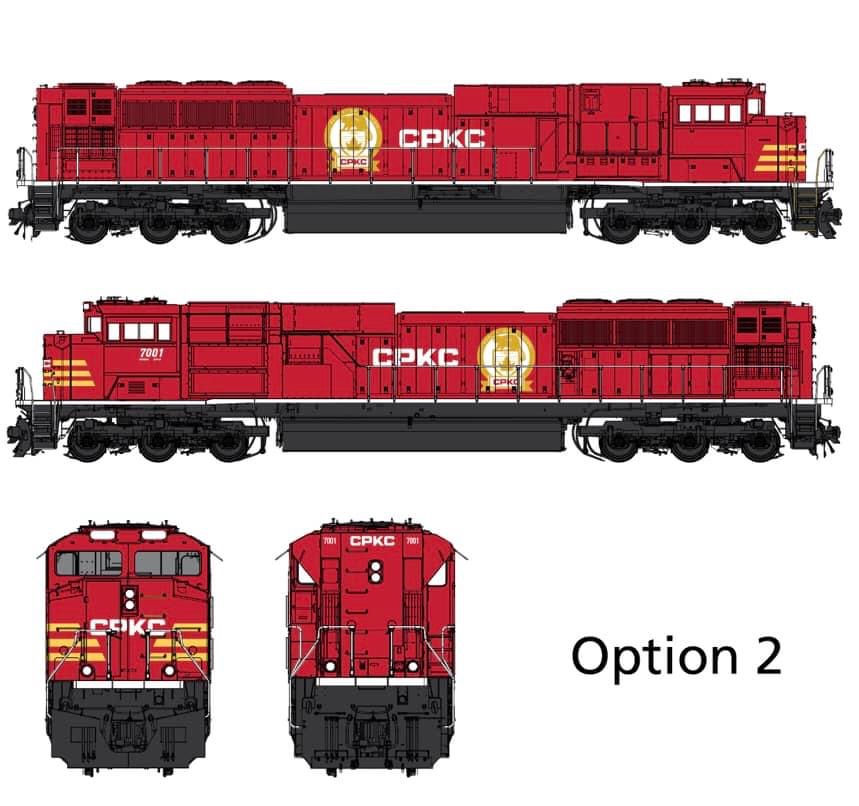
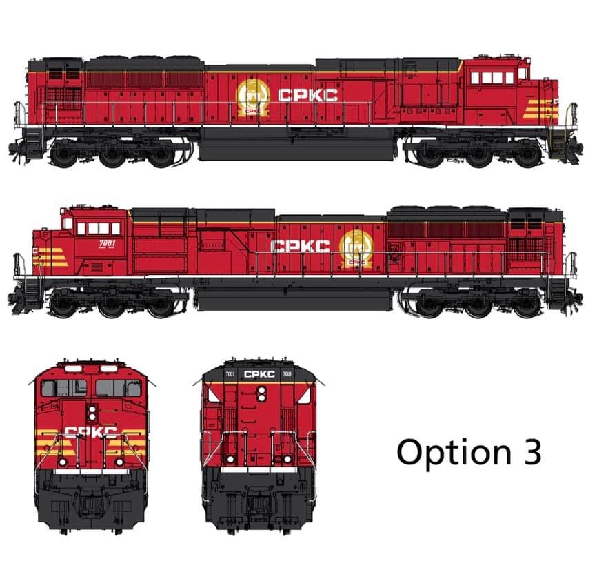
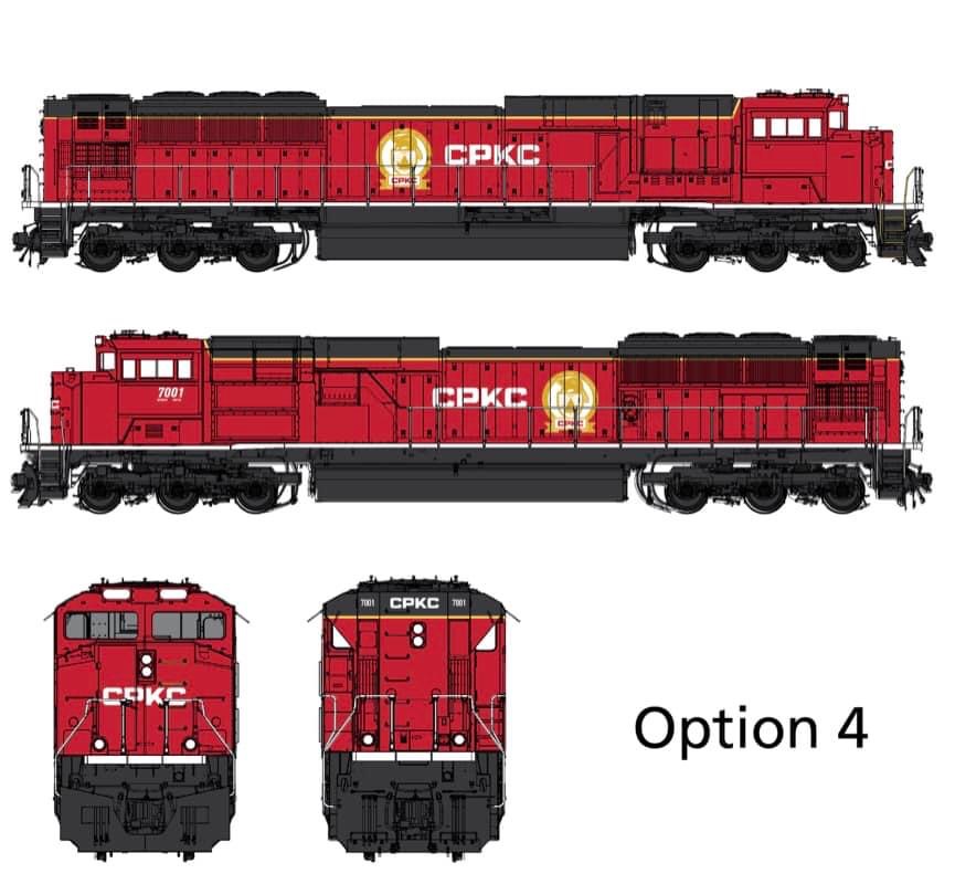
Canadian Pacific SD70ACU No. 7001 serves as the model for the liveries. Each of the five paint scheme options includes a side view of both sides of the locomotive, as well as a look at the front and rear of each livery.
Voting will close on June 15.

They all look like crap!
When will alphabet names go the way of disco ?
#1 looks like a subsidiary of Canadian National.
Go with #2.
I’m partial to #1 for the nods to historical schemes and overall look, but as noted, a bit close to CN. #2’s nose stripes aren’t a bad idea, but these look kind of BNSF-ish, nodding to the CB&Q or Frisco.
Number 2 is my favorite. 2-3-1-5-4 in my order of preference, but I don’t work for CPKC!
Leave the original paint on all units alone. On the cab put the CPKC along with the new unit number. Millions are going to be spent repainting most all units and why waste the money.
Really? Puh-LEEZ!
All have too much red. Retain Southern Belle Colors. That is the best scheme.
#1 for shoooooo. What a beaut! Still have both traditions.
I choose Option 2 with full red body with the classic CP medallion on each side fore & aft of “CPKC” on the left and right, respectively. The gold stripes echo the middle 20th century locomotive paint scheme on the front.
#2
IMHO, it’s a merger that never should have been allowed from a legal standpoint. But the U.S. government has seldom ever gotten anything right when it comes to railroads, so no surprise there.
From an aesthetic standpoint, it looks like we are losing what I thought were two really great schemes. They should’ve gone one way or the other instead of any of these options, which hardly pass for a mashup, if that’s what they’re supposed to be.
That’s because its only a merger in name only. This was a buyout by CP and since they get to keep their maple leaf instead of crossed standards of Canadian and American flags indicating the value of both systems.
In reality this should be labeled the CPkc Railroad as that is about as much say as KCS will have in the overall plan and scheme of things. They could have done a KCS one better by calling it Canadian Pacific of America as KCS did with its Mexican holdings, Kansas City Southern de Mexico…
Well, my choice would be #1 with the front cab stripes in #2. How does CPKC come out in French? Or is the full name never written on a loco?
The same way BNSF comes out in French….
Ambivalent to all paint schemes. The railroad name should have been changed to “KCP” [read into that any way you’d like]. Like a lot of railroad mergers, the “CPKC” mouthful won’t last [remember IC + GM&O ==> ICG? Or SAL + ACL ==> SCL, only to be absorbed into CSX, and the ill-fated SFSP]. Give it a distinction with a difference; A new name and a new paint color.
Gotta go with 5. However I would like to see the color scheme of current KCS used with different lettering.
1 or 5, but the name is lackluster.
Option 1 and then 4 for me.
They ALL SUCK as much as the name does. Completely change the name as well as totally new colors (Blue’s or Green’s that stand out).
I like red, black, and gold especially with tiger stripes on the nose but I think it’s time for CP’s Beaver/Maple Leaf logo to be put into CPKC’s history archives. Beavers do exist in far northern Mexico as well as the entire US and Canada but maple trees are hardly found in Mexico. By my informal internet research, the 20,000 mile CPKC operates about 9,000+ of its miles in the US, about 8,000 miles in Canada, and 3,000+ miles in Mexico. I think use of the CP logo tells the market that CPKC is really a Canadian RR when in fact 60% of its operating mileage is outside Canada. I think CPKC management should come up with a logo that doesn’t favor its Canadian roots.
Good luck with that one… Maybe their logo should be a giant “finger” because that is essentially what CP said to KCS and the rest of the Class Ones…
Why are they even bothering with integrating the KCS moniker? Did CN include the IC which had a much longer history & larger system, did UP ever include any of the numerous RR’s it gobbled up? They moved their U.S. office from Minneapolis to KC, why all the fuss over a insignificant RR? Hopefully they will return to their original logo one the honeymoon is over.
UP included parts of Missouri Pacific, Western Pacific, and Southern Pacific in their final names. They used their first name (Union) and the other three railroads last name (Pacific)… Perfect.
Option 1 gives KCS the largest “contribution” to the combined scheme while leaving CP Red at the forefront.
The large swath of Brunswick Green stands out boldly while the gold swath is complementary to both the Brunswick Green and CP Red and ties them together nicely.
Don’t dislike any of them, but for one guy’s opinion, I’d rank as 1,5,3,4,2.
Almost looks like you can paint it any color you want as long as it’s red.
REGARDLESS OF THE OPTION NUMBER, HOW ABOUT MAKING THE ENGINE NUMBER ON THE SIDE UNDER THE CAB WINDOWS LARGE ENOUGH TO READ WHILE WATCHING IT PASS @ 60 mph ? BOTH SIDES ALSO, I ASSUME. WOULD ALSO BE NICE WITH REFLECTIVE TAPE OR PAINT. WALTER FRITZ, OBER, INDIANA 574-772-4766
all 5 look great in my opinion
I say number 2.
I go for option 6 which is not even available or is not even being considered. I understand the desire for a unified paint scheme, but when you have two paint schemes like CP and KCS do the best option is to keep both of them and just change the names on all the equipment to CPKC from their current respective railroads.
How about a new name too, please. We have enough alphabet soup with CSX and BNSF.
Motion seconded.
Bring back the Multimark logo where Pac Man is a tortilla and in his mouth poutine.
And use the “WACA, WACA, WACA” sound (thank you Virtual Rail Fans) for its horn, kind of like when UP tried an air raid siren on a DDA40X back in the 80’s…
Number 1 or number 5 are both showing parent colors and shields of both railroads. An image of KCS’ Southern Belle logo would be honorable along with the CP’s Beaver logo. How about a Beaver Belle?
I would say #1 or # 5, I always liked the beaver logo. #1 and #5 both contain a part of KCS paint scheme. #5 has the band along the bottom of the hood running lengthwise and the black roofline aka KCS.
Which part? Oh yeah, the red!
I say #2 or 3. #4 wouldn’t be terrible. #5 looks like they’re trying to do too much. #1 looks too much like CN.