


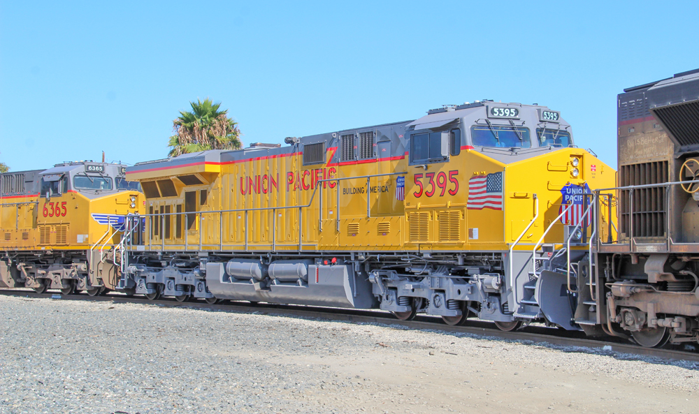
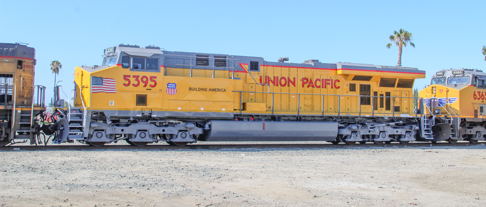
OMAHA, Neb. — Union Pacific is making the biggest change to its locomotive paint scheme in more than 20 years.
It’s by no means a radical change. The traditional Armour Yellow and gray with red trim remains. But departing is the large American flag decal on the long hood. A smaller flag will be placed on the side of the locomotive nose, ahead of the cab. Arriving, or returning, is red “Union Pacific” lettering on the long hood, a standard feature for much of the diesel era.
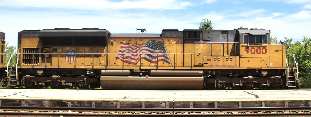
The flag decal was introduced to the sides of the locomotives in 2001 in memory of the 9/11 attacks, along with the UP shield and “Building America” slogan.
“That’s a really big decal,” says Shane Keller, UP’s senior vice president, engineering and mechanical. “And while we like that, the place we stuck it is on the carbody doors. Over time, what we’ve learned is that not only not the easiest place to do the install, but the heat generated by the engine has not been friendly to what a decal or a sticker for both longevity and, really, appearance.”
As any observer of UP locomotives can attest, those decals can often end up looking a bit, well, worse for wear.
“We get a lot of feedback from our employees about that,” Keller says. “Probably we get more feedback from our employees about the issue … than we do externally.”
And, in fact, it was employees who drove the process of coming up with a new design.
“The people who do the installs said, ‘How about you let us take another shot at this?’” Keller says. “What they said was the flattest canvas you have on the road locomotives is up on the nose. Let’s put the flags where they belong, in the lead, and let’s design something that’s easier to maintain and still is very respectful and honors our history and the mission of building America.”
That left a big space on the carbody, providing the opportunity to return the large “Union Pacific” lettering.
“That’s a little bit retro, if you know what I mean,” Keller says.
While one retro element returns, another departs. The winged UP shield on the nose — which was introduced in 2000, and harkens back to the design used on the railroad’s streamlined passenger locomotives — is being replaced by a larger, wingless shield.
“To us, to the people making the decisions, [the wings] didn’t look as good with where we placed the flags,” Keller says. “… What happened is the wings ran right into the flag, and we didn’t feel good about that.
“The shield takes center stage. The two things that are important there are that you’ve got the UP shield, and you’ve got our history, our mission. The shield and the flags are both up front. If somebody sees a locomotive coming at a crossing, those are the two things they’re going to see first.”
The design process took about six months, Keller says. The new look will be introduced very gradually to the road locomotives in the railroad’s fleet of more than 7,000 units.
“Anything that gets paint — which for now, is our modernized locomotives, our overhauled locomotives, and it could be something from accident damage — will be getting the new paint scheme,” he says.
UP locomotives which have been undergoing modernization at Wabtec’s Fort Worth, Texas, plant, are still receiving the old scheme while the new design was worked out, but will be transitioning to the new look shortly, Keller says.
He was a little surprised how quickly the first redesigned unit was spotted. Photographer Bruce Jacobs caught the repainted No. 5395 in Anaheim last week.
“You guys are quick, that’s all I’m going to tell you,” Keller said.
And as the new-look units begin to circulate, Union Pacific invites photographers to tag it (@Union Pacific) on social media, so the railroad can see where the engines are being spotted.

Looks good, so did the old but lets not take our eye off the ball, lets get back to good customer service, one car or 100 its all about treating your customers right.
It looks great to me, the only change I would have done is put the American Flag where the Union Pacific emblem is to match Building America and the emblem where the flag is with a smaller version of the wings under the emblem .
I love it ,especially the PGE/BC RAIL style lightning stripe and the retro sheild on the front, nice
I think it’s great and looks much better!
Guess I’m in the minority so far as I have no problem with the new scheme. I will miss the wings a bit and the nose shield could be a little smaller, but overall I’m good with it.
Take it from a 25-year PR guy who has had the opportunity to work on logo projects: the wings were outstanding and should’ve stayed. The flags could have/should be been shrunk, by maybe 30 percent, and placed a little further back so they’re not crowding the nose – which they are and it looks weird regardless of what’s on the front.
You have the UP shield on the side just behind the cab already – so tell everyone it’s OK to have a slightly smaller shield on the front with the wings – just like it was before.
This new look could’ve been worse and while it’s not ‘awful’ as-is, you’ve taken a step backward, UP. Sorry.
It’s surprising they’ve not elected a gray or brown primer scheme. Think about the shareholders and their rights, for once!
And this “redesign” took six months? (!)
Don’t really care for it. At least lower the “UNION PACIFIC” words to be at the same level as the engine number. That small change would look better. It now looks like the name was unintentionally placed too high because someone didn’t measure correctly.
I think the employees have better things to do with their time than worry about the placement of the American flag on a locomotive and what it’s appearance looks like. Perhaps something like maintenance so that your engines don’t keep quitting in route? (Heard numerous problems with locomotives while at my dad’s place in Palm Desert on the scanner: a/c units blowing out hot air, engines not loading, etc., etc.,)
So, they’re just going back to the old paint scheme?
To heck with the overblown in your face patriotism, even if it’s not quite as overblown as before. Bring back the wings!
The absence of the wings is a downgrade. The cynic in me thinks the large flag decals were “too expensive “. This is the PSR era , after all.