


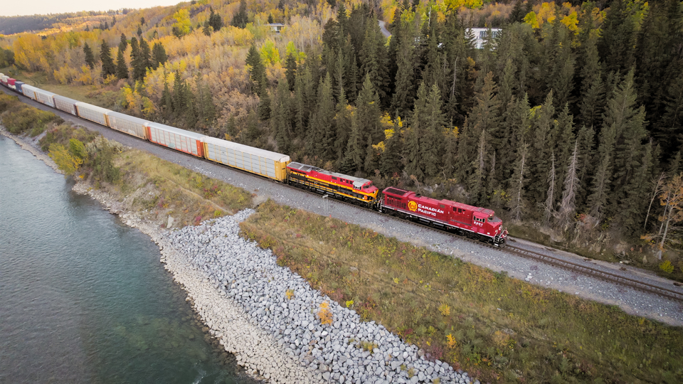
Canadian Pacific Kansas City, the first railroad to link Canada, the U.S., and Mexico, made its debut today and unveiled its new logo and website.
Officials from Canadian Pacific and Kansas City Southern will celebrate the historic merger at a final spike ceremony scheduled for 10 a.m. today at Knoche Yard in Kansas City, Mo., the only location where the two railways’ networks touch.
“Today, we celebrate this historic combination creating a truly unique single-line rail network that begins a new chapter of railroad history in North America,” CPKC CEO Keith Creel said in a statement. “As we mark this once-in-a-lifetime occasion by driving the Final Spike in Kansas City, Missouri, where CP and KCS come together, we stand ready to bring new competition into the North American rail industry at a time when our supply chains have never needed it more.”
CPKC will also break ground today on a new yard office, the future location of its state-of-the-art U.S. operations center.
“We stand ready to move the commerce of today and ready to compete hard to grow tomorrow,” Creel added. “With the most relevant railroad network on the continent, we’ll create value for all stakeholders, bringing new jobs, economic growth and environmental benefits to workers, customers and communities.”
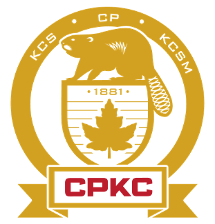 The CPKC logo is a modification of the logo CP introduced in 2017, an updated version of the railway’s heritage shield, beaver, and maple leaf. The CPKC logo replaces the words Canadian Pacific in the golden circle with the initials of the three railways that make up CPKC: KCS, CP, and KCSM. Bold red CPKC initials replace 1881, CP’s founding date, in the gold ribbon at the bottom of the logo. And the 1881 now sits atop the maple leaf, the symbol of Canada.
As of early this morning, there is no word yet on a new locomotive livery.
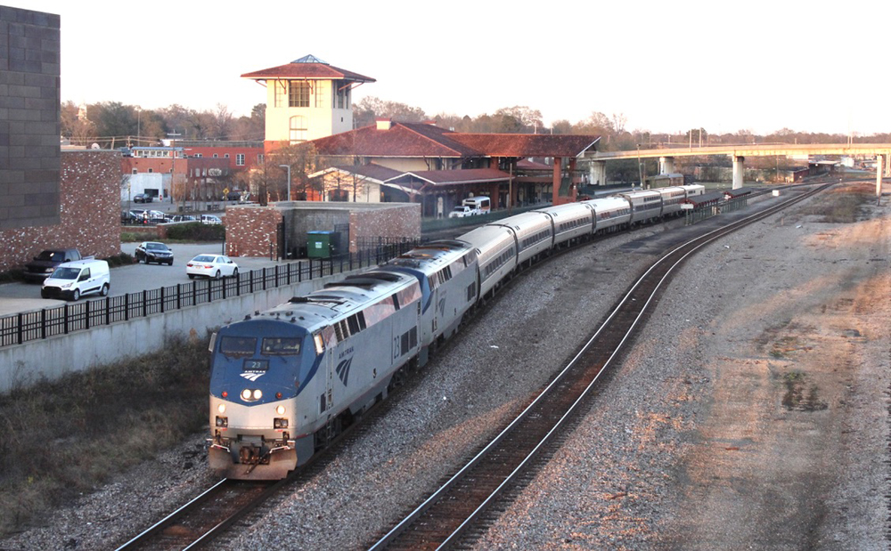
While the separate railway websites – cpr.ca and kcsouthern.com – are still up, they prominently point viewers to the new cpkcr.com website. The CPKC site includes a combined timeline outlining the history of both railways.
With its global headquarters in Calgary, Alberta, Canada, CPKC is the only railway connecting North America and boasts port access on coasts around the continent, from Vancouver to Atlantic Canada to the Gulf of Mexico to Lázaro Cárdenas on Mexico’s Pacific coast. While remaining the smallest of six U.S. Class I railroads by revenue, CPKC has a much larger and more competitive network, operating approximately 20,000 miles of rail, and employing close to 20,000 people. Full integration of CP and KCS is expected to take place over the next three years.
CPKC filed articles of amendment changing the company’s name to “Canadian Pacific Kansas City Limited,” which became effective today. CPKC’s common shares will remain listed on the Toronto Stock Exchange and New York Stock Exchange under the ticker symbol “CP” and are expected to begin trading under the new name on April 18.
CPKC also announced today the appointment of four new directors to the board of Canadian Pacific Railway Company, a wholly-owned subsidiary of CPKC, effective immediately.
“The addition of these members brings to the board a wide range of professional experience in transportation and logistics across the United States and Mexico,” said Isabelle Courville, chair of the board of directors of CPKC. “We are delighted to welcome these new board members, and we look forward to their contributions and learning from their previous experience at Kansas City Southern.”
Under the terms of the merger agreement, four Kansas City Southern directors join the board of the combined company. The four appointees are:
David Garza-Santos, a KCS director since 2016, is a business and community leader in Monterrey, N.L. Mexico, providing insight and leadership on the business and political environment across Mexico. He has been chairman and CEO of Maquinaria Diesel SA de CV (MADISA) since 1994.
Ambassador Antonio Garza (Ret.), a KCS director since 2010, is currently counsel to the law firm of White & Case in Mexico City. He brings strong diplomatic, legal and international business skills to the board developed through his experience as an attorney, and as U.S. ambassador to Mexico from 2002-2009.
Henry Maier, a KCS director since 2017, has spent his entire career working in various segments of the transportation industry. He served as president and CEO of FedEx Ground, a subsidiary of FedEx Corp., until his retirement in 2021.
Janet Kennedy, first appointed a KCS director in 2017, brings extensive executive leadership experience in business development, strategy, emerging technologies and technological transformation. She served as vice president, North America Regions, Google Cloud at Google, and previously held senior leadership positions at Ernst & Young and Microsoft Corp., including as president of Microsoft Canada.
These four directors will also be nominated for election to the board of CPKC at its Annual General Meeting scheduled for June 15.


Better yet, keep the two liveries intact and just use the new logo on all locomotives and railcars. There’s absolutely no reason in the world you have to come up with a new paint scheme or choose one over the other when there’s a merger, that’s just some marketing BS, customers don’t care about paint schemes, they only care about service and rates.
As this is a takeover of KCS by CP I see no reason for KCS to be included in the new name or logo. If UP took over CP I doubt highly the new name would be Union Pacific Canadian Pacific.
And I ask Canadians what would Sir John A and Pierre Berton say about this.
I hope that CP rail leaves the KC locomotives their Black ,Red & Yellow colors they have style, the Beaver insignia should include something from the KC railroad and its heritage that’s for sure. I really think the Canadian Pacific Red has got to go boring as Hell , its time for change and this is when to do it.
I got to Kansas City on a Frid’y
By Sattidy I larned a thing or two
‘Coz up to then I didn’t have an idy
Of whut the modren world was comin’ to!
I counted twenty gas buggies goin’ by theirsel’s
Almost ev’ry time I tuk a walk.
‘Nen I put my ear to a Bell Telephone
And a strange womern started in to talk!
Ev’rythin’s up to date in Kansas City
They’ve gone about as fur as they c’n go!
They went and built a skyscraper seven stories high,
About as high as a buildin’ orta grow.
Ev’rythin’s like a dream in Kansas City,
It’s better than a magic lantern show!
Y’ c’n turn the radiator on
Whenever you want some heat.
With ev’ry kind o’ comfort
Ev’ry house is all complete.
You c’n walk to privies in the rain
And never wet your feet!
They’ve gone about as fur as they c’n go,
“Kansas City” from the musical “Oklahoma!”
Like it or not, beavers are (back?) in force in America, even in Southeastern PA. I just saw my first beaver dam in Delaware County (outside Philly) on the Crum Creek. Sooooo cool! We welcome the beavers!!!!
I like the CP Beaver – always have. Mr. Nick – maybe the beaver gnawing on a bbq bone? Perhaps a cactus might be better than a maple leaf, considering the southward trajectory? It’s a great suggestion to use the classic CP gray and maroon, maybe with some incorporation of KCS’s logo (CPKC Lines). And script would be nice rather than the tasteless BNSF or CSX.
I think the initials spell out Canadian Pacific Keith Creel or am I just being cynical ? So expect the new locomotive livery when it arrives to be underwhelming – hopefully I’m wrong
Oops – I meant “North American Pacific”.
Just rename it the “American Pacific”.
Not very innovative. I think they should go with orange and black with the company name in a tilted red rectangle.
Logo only has elements of one of the three countries in which the new company operates. CPKC needs a better logo that accentuates its “NAFTA” goals. Otherwise it just looks like a Canadian invasion.
Exactly… Looks more like an absorption of KCS by CP than a merger of equals, especially with just the Canadian Maple Leaf versus having the three flags of Canada, the US and Mexico. Together they could be hooked on staffs at the bottom instead of the maple leaf which has no tie to KCS or KCS de Mexico.
But at the end of the day although it’s called a merger CP did pay 26 billion dollars for KCS so in my opinion it sort of gives them the right to use there heritage as a dominant feature of the new logo.
CPKC is somewhat euphonic, a lot better than the awkward mouthful BNSF which we all got used to. Also Kansas City is on the trail the “Mountain Men” used headed west to the Rockies to trap beaver, so that it has some, probably unintended, relation to both names.
A number of interesting comments on the string here.
The “CPKC” moniker might take some getting used to, but if nothing else, I guess the merged CP Rail/KCS/KCSM really is the first “NAFTA” Railway (operating in all three “NAFTA” countries).
And as an American, I do indeed like the “Beaver” and find it a truly classic ‘Canadian’ logo. Again, the “CPKC” name is going to take some time to sink in ……
Where does the Panama Railway fit in now? What is its status?
Congratulations CPKC. You will operate seamlessly in North America. Wise, prosperous thinking in an ostrich railroad world.
RICKY — Thanks for your post. May I add that the ostriches included the towns and cities along the r/w and the politicians at the local, state and federal level..
Congratulations CPKC. You will operate seamlessly in North America. Wise thinking in an ostrich railroad world.
El castor dorado.
Why even bother including KCS in it moniker it a minor player? CN didn’t include the IC, same with UP’s acquisitions they just disappeared. Hopefully its only temporary team building endeavor that will disappear in a couple of years.
UP did include SP in their name….Pacific
Same with Missouri Pacific and Western Pacific and the Chicago, Rock Island and Pacific.
Meant to say what an SP wag said after the UP-SP merger. “They’ll use their first name and our last name!” And so they did in every case: Union plus Pacific of the various roads…
It is a Union of Pacific railroads.☺
OK, Glen and Vincent-
Please apply your pretzel logic tot he absorption of the Chicago & NorthWestern. I have some popcorn heating up right now….
They could be like UP and never mention who you just took over, excuse me, merged with. Just keep using the same old shield. At least KC is in letters on the emblem.
It’s worse than that. There have legally been four different Union Pacific companies, after bankruptcies in 1880 and 1897 and then in 1998 SP bought UP and renamed itself to UP.
Not hardly, Rio Grande Industries bought SP and kept it SP. UP just finished the unfinished work… Rescuing a decrepit railroad run into the ground by bad management…
The golden rodent strikes again!!
The new Logo sucks! Beaver? Please! What in this logo represents Kansas City.
It should at lease have the Beaver getting BarB-Q. Maybe then someone might
remember Kansas City.
This Logo SUCKS!
I am sorry that the logo upsets you, Canadians have no issues with Beavers. WE enjoy beavers they are a Canadian symbol.
It is easy to criticise, what do you propose? Personally I prefer the classic grey and maroon with Canadian Pacific in script. Hard to improve on the classics.
Good comment Terry. Since there’s no way to split the difference between the current KCS and CPR incompatible liveries, go back to the classic CPR livery from long ago.
Too many words to fit in, I’m sure, but KC could be represented by a footnote that says “They gotta lotta pretty women there and I’m gonna get me one.” …..On reconsideration, better not. Can’t talk like that these days.
I have great faith that this new merger will thrive and prosper, unlike any other merger of the past. CPKC will become the best railroad in America, and it should be a wake up call to the other big 5 that they need to get their heads out of the sand and start running their prospective railroads right.
I’ll take that bet. It might thrive and prosper but that’s easy when you’re still #7. They don’t serve anywhere in the West and their only major way to Mexico is track rights over UP tracks. KCS won’t make CP any less of a foreign rail on US tracks than it already is and now they will have even more US STB oversight than they probably realize… with no friends in Congress. Good luck with that.