amtrak-announces-new-paint-schemes-in-youtube-videohttps://www.trains.com/trn/news-reviews/news-wire/amtrak-announces-new-paint-schemes-in-youtube-video/Amtrak announces new paint schemes in YouTube video - TrainsWASHINGTON — Amtrak will paint at least six locomotive in new and heritage paint schemes in the coming months in honor of the railroad’s 50th anniversary this year. In a YouTube video launched Tuesday, March 16, an Amtrak representative discusses the history of the railroad’s liveries and detailed the newest paint schemes well into the [...]Read More...https://www.trains.com/wp-content/uploads/2021/03/TRN_Amtrak_-Midnight_Blue_Day_One_Livery_03.21.pngInStockUSD1.001.00news-wirenews-reviewsarticleTRN2021-03-162021-03-1697632
U.S. passenger railroad introduces new Day One livery for to-be-built Charger No. 301; other designs planned
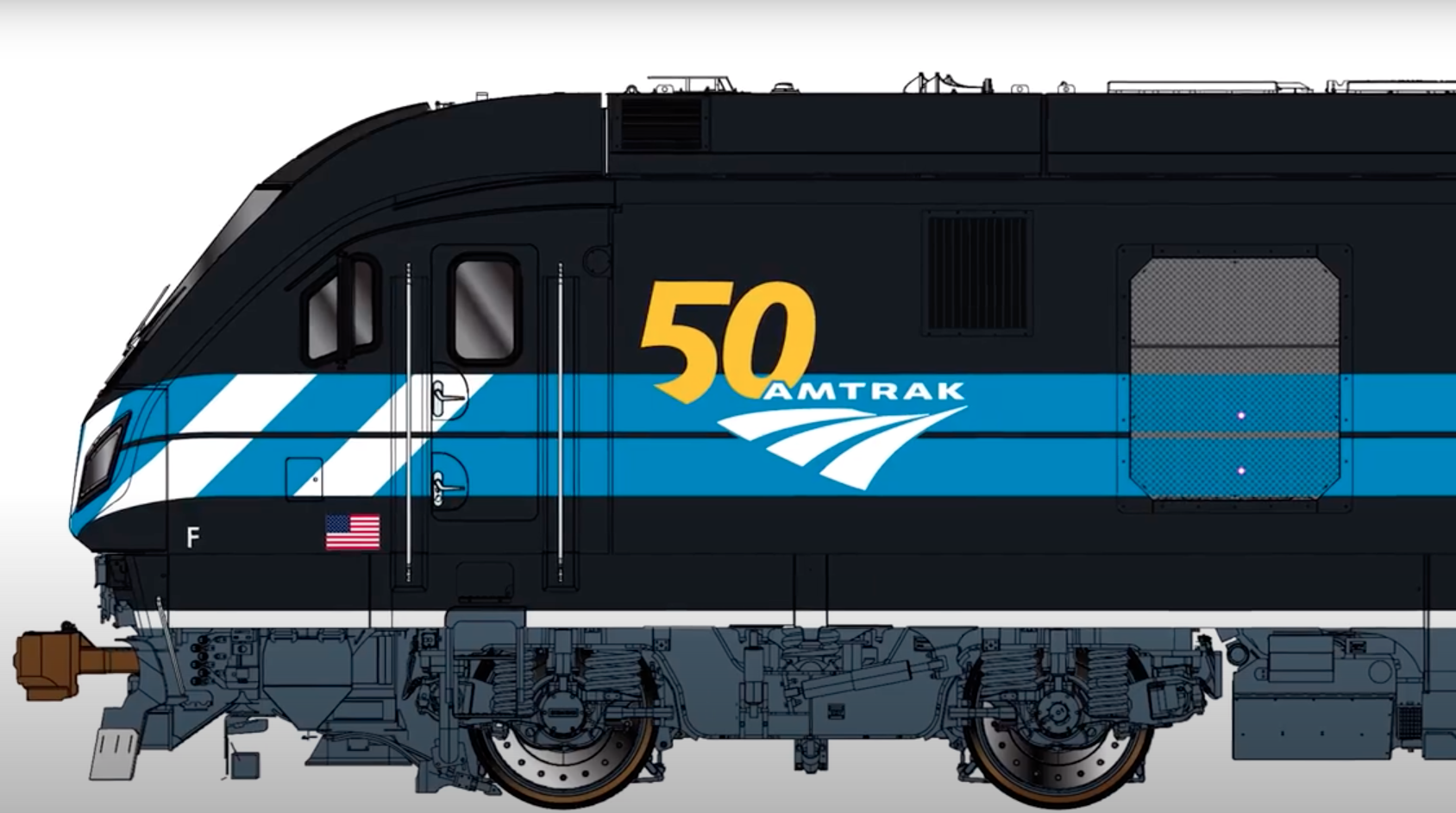
An artist’s illustration of a Siemens-built Charger diesel locomotive wearing Amtrak’s Day One paint scheme. Screen image capture of Amtrak video via YouTube
WASHINGTON — Amtrak will paint at least six locomotive in new and heritage paint schemes in the coming months in honor of the railroad’s 50th anniversary this year.
In a YouTube video launched Tuesday, March 16, an Amtrak representative discusses the history of the railroad’s liveries and detailed the newest paint schemes well into the presentation.
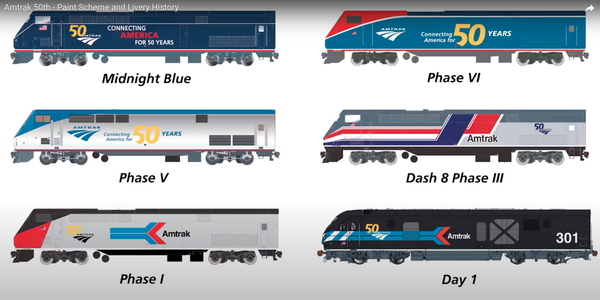
Six Amtrak locomotive paint schemes taken from a video screenshot. Amtrak via YouTube
20 thoughts on “Amtrak announces new paint schemes in YouTube video”
I like them, and glad they are recognizing their anniversary. I was talking to a couple of conductors on Lincoln Service last week and they have been getting some 50th anniversary gifts, but have heard nothing about a special display train traveling around the system like they did for 40th. I may have to wear my 40th and put a sign plus 10 on it, ha ha. Even a couple with the old arrow logo. Very cool. Glad LD trains will be back on daily schedule by early summer, and the furloughs will be back to work. Congrats, Amtrak, many people did not expect you to last this long.
Very nice Nice to see more Heritage Paint schemes on the classic P42s as well. They also should bring back the Exhibit Train for their 50th Anniversary as well.
Amtrak peaked with ph3.
Great scheme representing our great country. Gave the trains a great sense of continuity.
Ph4 was ok, but on a steady downhill slide from there.
“Am I the only one who looks at the Amtrak logo and sees a feather fan, of the kind you see in movies where the servant is fanning the boss?”
Mr. Baird, I always thought of it as a pair of rails negotiating rolling plains. But I like your analogy. I still think of it as an improvement over the inverted arrow.
As for the PC logo, I was in grade school and middle school during the PC era and to me it was just a logo, never thinking of it as mating worms, nor do I do nowadays.
To me the Amtrak paint schemes are just that – paint schemes.
Guess it’s all in the eye and mind of the beholder…
“Mr. Baird, I always thought of it as a pair of rails negotiating rolling plains. But I like your analogy. I still think of it as an improvement over the inverted arrow.”
I remember that being the explanation when the logo was introduced. It’s one of those optical illusions where what you see depends on whether you’re seeing the positive or negative space. You can see the two blank curves representing the rails or the three curved shapes that look like…I don’t know.
The black and dark blue schemes are awful to look at. Then again, my last three cars have been silver, which are cheaper, hide dirt better than other colors, and are least likely to get pulled over by police — your mileage (*cough*) may vary.
Excess in the promotion of utility and efficiency is no vice.
Two points: 1. I have really yet to see a truly attractive Amtrak scheme, and I say this as a lifelong railfan and as a guy who has had commercial art training and experience. 2. Am I the only one who looks at the Amtrak logo and sees a feather fan, of the kind you see in movies where the servant is fanning the boss?
RUPPERT – I’m with you. I rate the various Amtrak schemes as on the whole mediocre. One thing I will say, though, each new Amtrak livery has tended not to clash with previous schemes. Like the Rock Island did – you put one Rock Island livery in a lashup with the another, it was so bad you couldn’t even look.
I don’t believe the solution is to rush into a new livery. Take a breath and sketch something that will last a while and won’t need to be re-done after a couple of years.
It’s not just Amtrak. There’ was some really awful commerical art in Amtrak’s founding decade, the 1970’s. Look at that decade’s liveries for several of the airlines — bad bad bad. There were only a few I liked, among them Eastern, followed by Braniff late in that decade. Even now, American’s current livery is an eyesore.
I believe the black scheme on day one was applied to a Penn Central E 8 unit that was all black
Correct about the Penn Central E8. Not pretty but hey, it happened.
It was. I believe it was PC 4316. I saw it way back when in of all places Penn Station in NYC
I have yet to decide what I think about the upcoming phase VII livery but I do have to give Amtrak a great deal of credit for producing an entertaining and informative video on the history of Amtrak liveries. Full of interesting details for all Amtrak fans. Definitely produced at the right level!!!


I like them, and glad they are recognizing their anniversary. I was talking to a couple of conductors on Lincoln Service last week and they have been getting some 50th anniversary gifts, but have heard nothing about a special display train traveling around the system like they did for 40th. I may have to wear my 40th and put a sign plus 10 on it, ha ha. Even a couple with the old arrow logo. Very cool. Glad LD trains will be back on daily schedule by early summer, and the furloughs will be back to work. Congrats, Amtrak, many people did not expect you to last this long.
Phase VI: thumbs up!
Phase VII: barfaghetti!!!
Very nice Nice to see more Heritage Paint schemes on the classic P42s as well. They also should bring back the Exhibit Train for their 50th Anniversary as well.
Amtrak peaked with ph3.
Great scheme representing our great country. Gave the trains a great sense of continuity.
Ph4 was ok, but on a steady downhill slide from there.
“Am I the only one who looks at the Amtrak logo and sees a feather fan, of the kind you see in movies where the servant is fanning the boss?”
Mr. Baird, I always thought of it as a pair of rails negotiating rolling plains. But I like your analogy. I still think of it as an improvement over the inverted arrow.
As for the PC logo, I was in grade school and middle school during the PC era and to me it was just a logo, never thinking of it as mating worms, nor do I do nowadays.
To me the Amtrak paint schemes are just that – paint schemes.
Guess it’s all in the eye and mind of the beholder…
“Mr. Baird, I always thought of it as a pair of rails negotiating rolling plains. But I like your analogy. I still think of it as an improvement over the inverted arrow.”
I remember that being the explanation when the logo was introduced. It’s one of those optical illusions where what you see depends on whether you’re seeing the positive or negative space. You can see the two blank curves representing the rails or the three curved shapes that look like…I don’t know.
Yawn…putting lipstick on a pig.
Ooh, schmexy.
penn central,with a little blue,yuck then yuck now
The black and dark blue schemes are awful to look at. Then again, my last three cars have been silver, which are cheaper, hide dirt better than other colors, and are least likely to get pulled over by police — your mileage (*cough*) may vary.
Excess in the promotion of utility and efficiency is no vice.
Two points: 1. I have really yet to see a truly attractive Amtrak scheme, and I say this as a lifelong railfan and as a guy who has had commercial art training and experience. 2. Am I the only one who looks at the Amtrak logo and sees a feather fan, of the kind you see in movies where the servant is fanning the boss?
RUPPERT – I’m with you. I rate the various Amtrak schemes as on the whole mediocre. One thing I will say, though, each new Amtrak livery has tended not to clash with previous schemes. Like the Rock Island did – you put one Rock Island livery in a lashup with the another, it was so bad you couldn’t even look.
I don’t believe the solution is to rush into a new livery. Take a breath and sketch something that will last a while and won’t need to be re-done after a couple of years.
It’s not just Amtrak. There’ was some really awful commerical art in Amtrak’s founding decade, the 1970’s. Look at that decade’s liveries for several of the airlines — bad bad bad. There were only a few I liked, among them Eastern, followed by Braniff late in that decade. Even now, American’s current livery is an eyesore.
I believe the black scheme on day one was applied to a Penn Central E 8 unit that was all black
Correct about the Penn Central E8. Not pretty but hey, it happened.
It was. I believe it was PC 4316. I saw it way back when in of all places Penn Station in NYC
I have yet to decide what I think about the upcoming phase VII livery but I do have to give Amtrak a great deal of credit for producing an entertaining and informative video on the history of Amtrak liveries. Full of interesting details for all Amtrak fans. Definitely produced at the right level!!!
Love these treatments. Something optimistic and positive from Amtrak!
I very much like what I see!
very nice.
I did not realize Amtrak had a different paint scheme on Day 1 of midnight blue. I like the heritage paint schemes.