


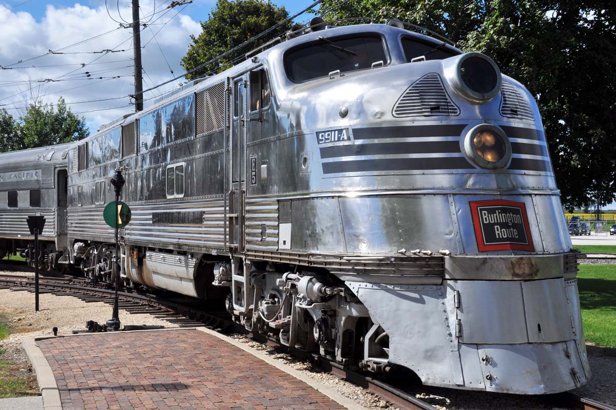
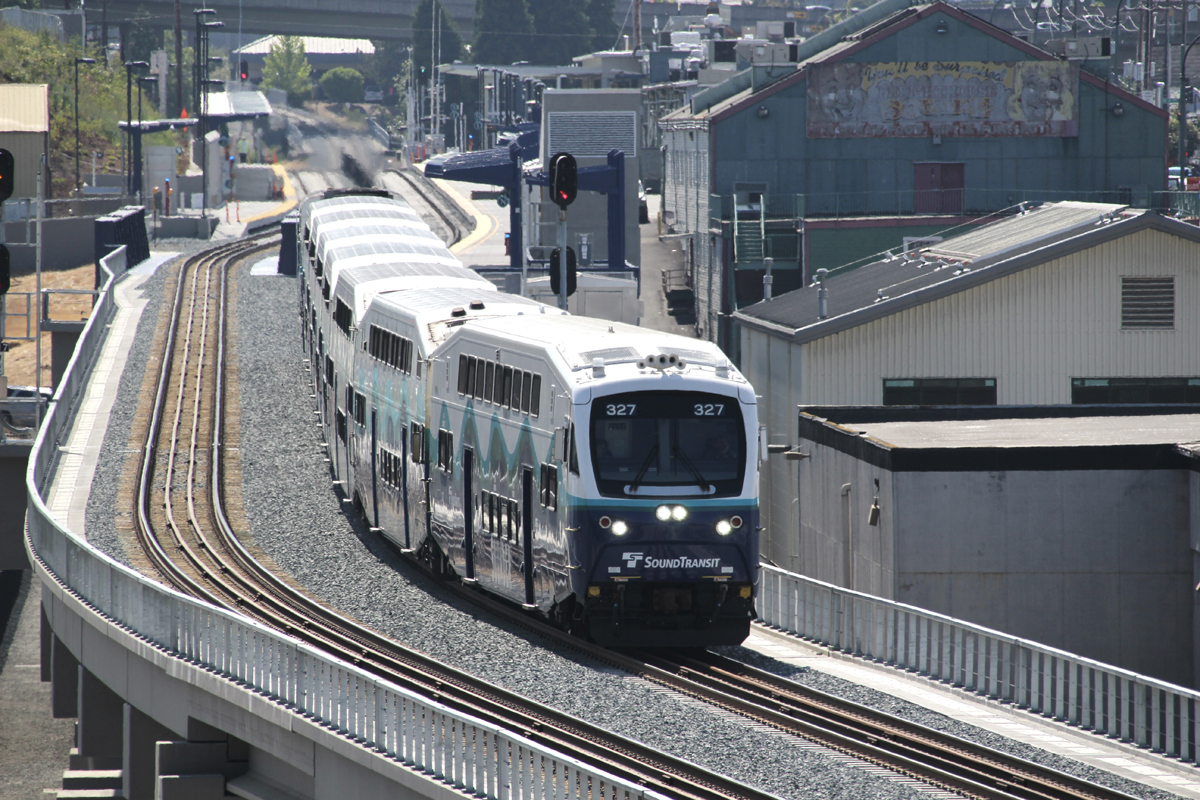
Former Burlington E5 No. 9911A rests between runs at the Illinois Railway Museum in Union in 2015.
Don Nickel
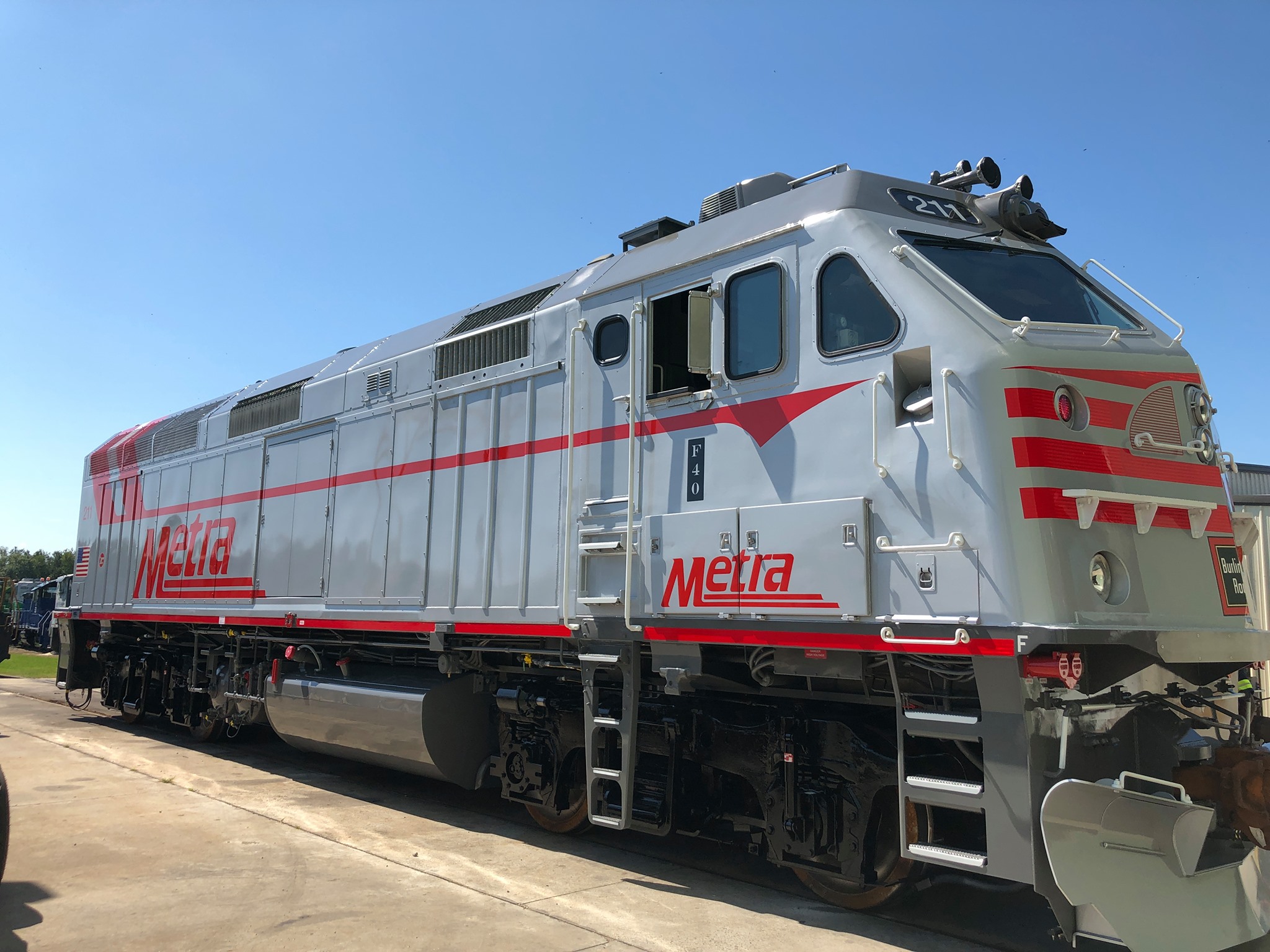
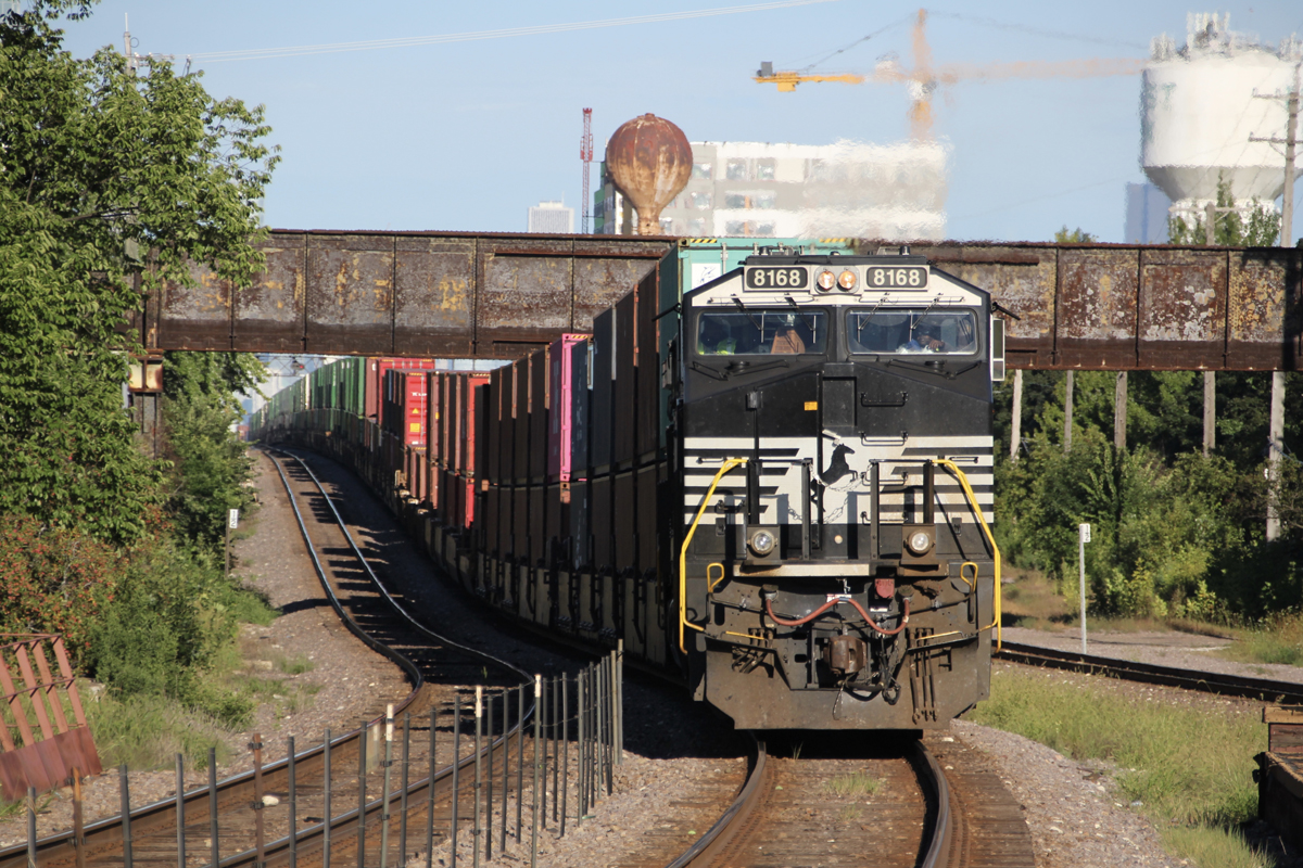
Metra F40PHM-2 No. 211 displays its Burlington-inspired paint scheme.
Metra
CHICAGO – Commuter carrier Metra has unveiled its latest commemorative locomotive, EMD F40PHM-2 No. 211 in a faux-stainless Chicago, Burlington & Quincy paint scheme. The locomotive shares many paint features with the classic stainless steel diesels of the Burlington, including E5 No. 9911A that resides at the Illinois Railway Museum in nearby Union. That includes the locomotive designation, in a vertical format, just ahead of the cab door.
The 3,200-hp model, unique to Metra, is a derivative of the classic F40PH passenger locomotive. It is used on the railroad’s BNSF Railway service between Aurora and Chicago Union Station.
The locomotive follows other such commemorative paint schemes honoring Chicago area fallen flags including MP36PH-3S No. 405 painted for the Milwaukee Road and No. 425 painted for the Rock Island.
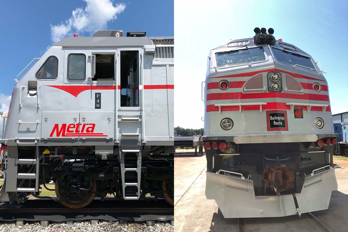
Two photos, Metra

I agree with Jim Kerner on a couple of points. Yes, black stripes on this engine would stand out against the faux stainless a lot better. But it is a snappy looking unit. The builder’s plate was a nice touch.
I too wish the LIRR would do a couple of units in the 1960’s gray/orange scheme the C 420’s were delivered in, though it would have to be modified to work on the current power. That, to my mind, was the best looking LIRR diesel scheme.
Ed Schnabel, nope. It is on there correctly according to the US Flag Code. Blue is to always be on the left when looking at it when it is printed.Makes no difference which way the cab of the loco is.
I think that the METRA Engine would look better with the black stripes than the red ones. Otherwise, I like it. What I would like to see the MTA apply the Orange and Gray colors on some LIRR engines. Also, have the map of Long Island on these engines. Also, on Metro North, apply the New York Central colors to the cars and engines. Last but not least, Staten Island should have some of their cars painted into B&O colors. I hope somebody from the MTA sees this. I just remembered, the LIRR was part of PENNSY. So, some equipment should be painted in Tuscan Red.
Appreciate the effort and intent; the result, not so much.
they could have painted the trucks silver
that would look a lot better
For all those saying they could’ve painted the trucks silver, they could’ve used a more attractive locomotive.
I have to agree with the other commentators. This one does nothing for me. Of the many various heritage units on the various freight and passenger railroads this is the first outright swing and a miss. My cat Burlington appreciates the intent but not the result. Yes it’s hideous and no it doesn’t look like Burlington at all.
Actually METRA doesn’t even need a heritage locomotive. Many of the cars on METRA-BNSF are still labelled Burlington 49 years after that railroad was merged into BN. That’s not heritage, it’s the actual thing!!!!
RICHARD LITTLE. On the subject of silver trucks, I never liked the UPRR colors after the silver trucks became brown maybe around 1980.
These are commemorative, not replicas. To commemorate a war, you don’t create a replica, deaths and all, You simply reproduce certain parts. That is what they have done here.
Today’s Cadillac’s don’t look anything like the tailfin era, but the current tail light design commemorate that design era.
As it is they could reskin the whole thing in stainless and people would still say its not good enough.
Having been born and raised in Downers Grove, Ill. one of the towns along the BNSF line this does not not remind in the slightest of all the trains I saw in the 50s, 60s and 70s.
The nose is the only part of the scheme that recalls the Burlington look. Nice try, but put it run a few more drafts before actually putting it on a locomotive. Oops, too late . . . .
Personally I think that they did a good job, especially the nose. The “F40” badge on the cab sides is a nice Q touch
Just in case anyone is wondering why one of the slant nose MP36’s wasn’t used, they are not used in Metra / BNSF service.
I believe this one lost something in the translation. Should have left off the red arrow stripe and the Metra logo on the cab. The big Metra logo on the flanks should have been black and in the same font as that used on the real E-units.
So, divided opinion on this. The Milw. Rd. effort was more interesting, due to color scheme and the Hiawatha logo. Pretty tough to duplicate the CB&Q stainless.
That looks horrible….lol
Could Metra do a CNW heritage loco? Or would they need UP’s approval first?
Great idea. I really like their Rock Island painted unit and I would like to see more in different paint schemes. This one looks decent from the front, but when viewed from the side, I would have no idea that this is supposed to represent CB&Q.
Of all commuter lines in US, likely the one most identified with its heritage is METRA/ BNSF.
Great job there!
Love it! Nice job Metra on this F40PHM. I wish that Metrolink would paint a few F125s in a heritage scheme but that’s unlikely to happen.
I’d like to see Metra paint 1 of its Ex Amtrak F59PHIs in a special heritage paint scheme as well and possibly 1 of its future SD70MACH units as well. I wouldn’t mind a Burlington Northern painted heritage unit that would be nice.
Love it.
Very nice, there is one problem, US Flag on the rear, right side, is wrong, the blue shield should be leading not following.