


Car Swap Project Part 4: Railroad herald design class: Gerry Leone, Seth Puffer, and David Popp all model freelanced railroads, and each has created names, heralds, and graphics for their fictitious lines. The car swap project spans three different time periods during the 20th Century, so to make cars that work for each other’s railroads, the heralds needed to be updated or backdated to match. This installment covers the process they used to make new and old graphics for the cars.
Gerry: So now that at least some of us have done some stripping and repainting work, the Car Swap plan is really moving. That means it’s time to make decals for the Olympia & Sand Creek, the Puffer Bridge Lines, and my Bona Vista. I have an ALPS printer which does a great job of printing logos on decal paper. And it would have been simple to do right then and there, except…
David: We have a time-travel problem.
Seth: My PBL logo isn’t really going to look right on David’s logging layout, you know.
David: And ditto for Gerry’s BV logo.
Gerry: We’ll need multiple logos for each of our railroads because our layouts are set in different time periods. David’s is set in the 1920s, mine is mid-50s, and Seth’s is 90s. Those logos need to be different than what they are today.
David: I know good design when I see it, but I copy other things when possible, so I’m not necessarily the one to get it started.
Seth: Like I said back in part 1, I’ve never even thought about how my railroad’s logo would look in other eras.
Gerry: I’ve worked with some great designers in my career, so I know I’m no logo designer. I don’t even resemble one. I’ve been told for decades that the Bona Vista logo is too modern for a 1950s railroad, and I agree. But after having 80 cars with that decal on them, I’m not about to change now.
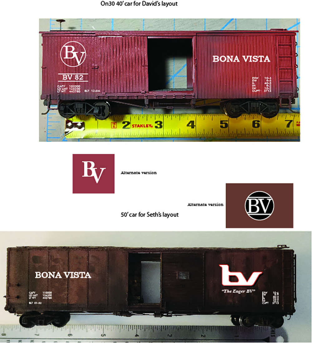
David: I do have some Olympia & Sand Creek logos that I had made a couple of years ago, but they’re all in O scale, and you guys model in HO.
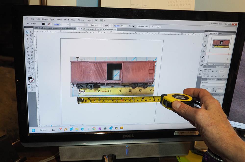
Gerry: And that’s another thing: I’ve never done a logo for a car that wasn’t HO scale. So, I had David take a photo of an On30 car and add a ruler beneath it. The best software to design logos with is Adobe Illustrator. It’s a difficult program to learn, but its output is in vectors, rather than rasters. Working in vectors will give you diagonal and curved lines that have no jagged edges. However, if you print decals from artwork that uses rasters, such as Photoshop, you will get jagged edges.
David: The custom decals we’ve made here at the MR offices have jagged edges, so they must have been raster files.
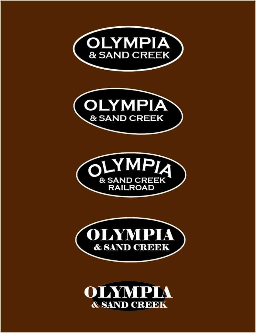
Gerry: Very likely. As shown in the first photo, I brought David’s photo of the On30 car and ruler into Illustrator and put it up on my screen. I resized it until the ruler in the photo was the same size as the actual ruler I held in my hand. That way, as I designed, I could see if the logo looked too large or too small on the car. Given that David’s Olympia logo follows a semi-circular path, it would have been natural for the railroad to want an updated logo that would also follow a semi-circular path for continuity’s sake. That was their 1920s corporate look. And maybe some 1950s designer…
Seth: I guess that’s you.
Gerry: You guessed right. Maybe that designer would follow suit with other railroads of the era and add some sort of graphic to enclose the words, like a box, a circle, or an oval! And naturally the logo would be black and white, because, by and large, the 50s weren’t about being splashy.
David: What about the typeface? My Olympia cars were all lettered using Railroad Gothic.
Gerry: As a final touch, I added a typeface that was popular at the time – in this case Copperplate – and voila! A logo is born.
David: Actually, Gerry made me a whole page of heralds, and we debated them for a bit before we made a few last modifications to get the one I wanted.
David: Once we got the herald down, Gerry and I talked about giving Olympia some sort of catchy slogan. I’ve always liked CB&Q’s Everywhere West splashed across the sides of boxcars. I sent Gerry a dozen or so ideas.
Gerry: And I sent David back a dozen more.
David: This actually was very like my day job when we’re trying to come up with marketing materials and names for new products. Eventually, Gerry sent me one that made me laugh out loud, “AND is our middle name,” which for the quirky little Olympia & Sand Creek RR, fit perfectly.
Gerry: Done! The 1950s car was easy. Designing a 90s logo for the Olympia was harder.
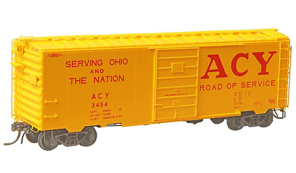
David: Falling back to my picking good designs, I sent Gerry a photo of an Akron, Canton & Youngstown boxcar. I always loved the bright yellow cars with the big red ACY on one side and the “Serving Ohio and the Nation” slogan on the other. Although I’d already painted Seth’s car blue and black (see part 3), I thought we could do something with this overall look.
Gerry: By the 90s, I felt Olympia would have wanted to show the world that it’s progressive, forward thinking, and anything but backwoods.
David: Hey, we’ve got geared locomotives – our trains can run in both directions easily enough!
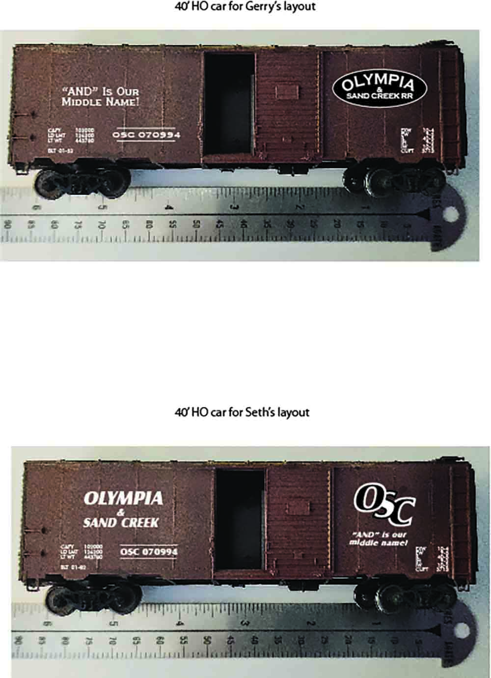
Gerry: So, an italic, forward-looking typeface would be perfect. Following David’s idea of the ACY, and also downplaying rural-sounding Olympia & Sand Creek name, I made a bunch of options using just OSC.
Seth: I liked the italicized forward-leaning version the best.
Gerry: Which is good because it will go on your layout. Stacking the letters improved the look as well.
David: Instead of ACY’s “Serving Ohio” slogan, Gerry and I went back to the drawing board on 90s slogans, generating a whole new list of them.
Gerry: David came up with “Don’t be Skimpy, Ship Olympy!” It had a great marketing ring to it, so that’s what we rolled with.
David: Gerry mocked up the final look for both cars using photos of standard 40-foot boxcar models. Even though the colors didn’t match the final cars, it gave a good idea of what these graphics would look like when complete.
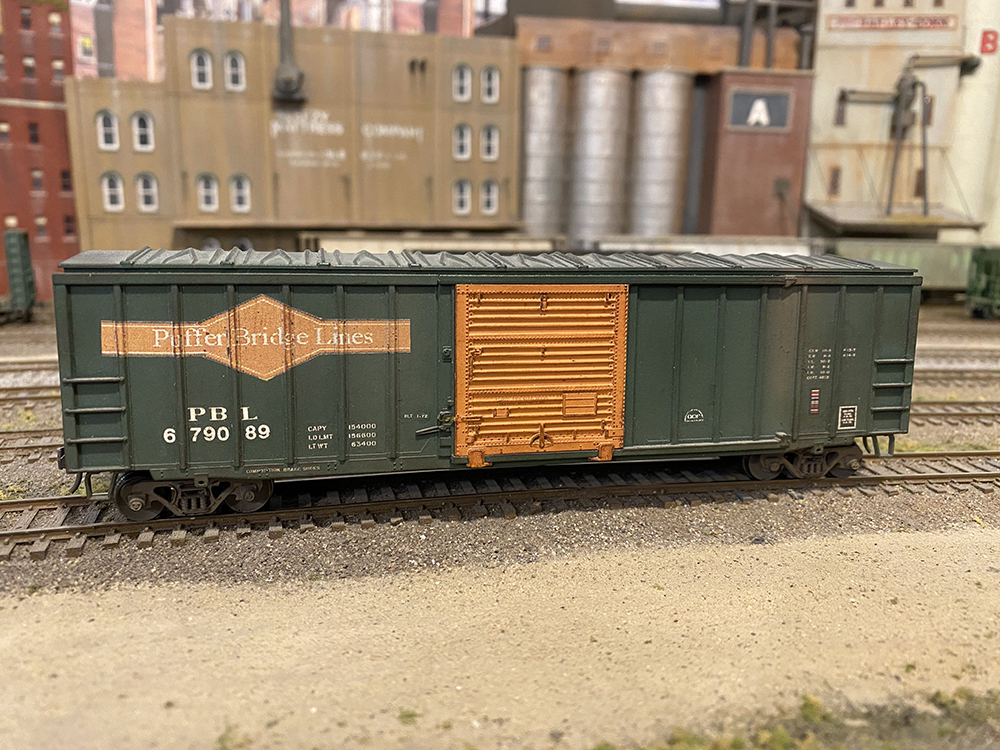
Seth: With David’s cars settled, it was on to Puffer Bridge Lines!
Gerry: Backdating Seth’s PBL logo was a bit easier. Going back to the 50s and the rationale I’d used for David’s logo, I wanted to give the railroad a solid, trustworthy, “rely on us” look. I set PBL in a classic typeface, like Bookman, to help convey that image.
Seth: So, you’re going to just float the letters in space?
Gerry: Nope. I’ll add a black and white diamond behind them to anchor them.
Seth: It reminds me of a one-off design I did years ago for my single PBL house car.
David: I’m still amazed you have just one freight car on your entire railroad painted for your home road.
Seth: It’s true. You’re welcome to make more for me.
David: Pass!
Gerry: It may be just one car, but it was a great starting point, so that’s the look I went with.
Gerry: Bringing the PBL logo further back to the turn of the 20th century was easy. I kept the same solid, classic typeface, but made it a bit larger and added just the simple outline of the diamond behind the letters.
David: So, you went from 90s to 50s, to 20s.
Seth: He did. But when you look at it the other way, the evolution of the PBL logo from early 20th century to late 20th century is easy to see. I like that.
Gerry: Then came the tough one: the BV logo. It already was a 90s-looking logo on a 50s car thanks to my initial lack of design sense in the 70s.
David: Did the 70s have a sense of design?
Seth: Nobody had any design sense at that time.
Gerry: Including me. The best thing I could do to update it would be to add a graphic element that really came into its own in the 80s and 90s: a drop-shadow. Adding a black drop-shadow behind what I call “the flying goose” logo made it stand out. Then adding a red outline to the logo gave it splash of “look at me” color.
Seth: A minor evolution, but an evolution just the same.
Gerry: The easiest design was the turn-of-the-century Bona Vista logo. I’d actually toyed with some ideas years ago and put one of the ideas on two old wooden-sided cars. It was just simple BV letters overlapped into one graphic form. In my mind I can see how the simple, locked BV letters evolved into the curvy, modern BV logo I’ve used for decades.
David: That’s the same mind that was around in the 70s, right?
Gerry: With the designs done, I superimposed the logos on to the photos of the freight cars and sent the results to their owners, both of whom approved them on the spot.
Seth: Those turned out great!
David: You said it! When can we start decaling?
Gerry: In the next installment, I’m hoping to be able to wake a 25-year-old computer from its storage room sleep and fire up my equally as ancient ALPS printer. If we can’t print the designs we made, the project will be more difficult to complete.
David: But not impossible!
Follow the links below to read the previous installment in the Car Swap Project series!
Car Swap Project Part 1: Trading models

Loving the series so far. Can’t wait to see them in their travels.
You three are amazing! Don’t know what I enjoy more – the actual work that you are doing on these cars or the bantering back and forth 🙂
Nice series
How about Kalmbach producing these cars for sale ?
YEAH! As long as the owners get a cut of the profits!! 🙂