Five worst paint schemes
When it comes to a diesel locomotive’s paint scheme, I know what I like. I’m also 100 percent sure that no one else who follows the industry will agree with what I think of as the worst modern diesel locomotive paint schemes, and that’s okay. Below is my list of five schemes only a mother could love. While a few are already gone, others are still out there but will someday become a part of the history of railroading. When that finally occurs, I won’t shed a tear when the last one is finally retired or repainted!
No. 1: CSX stealth gray
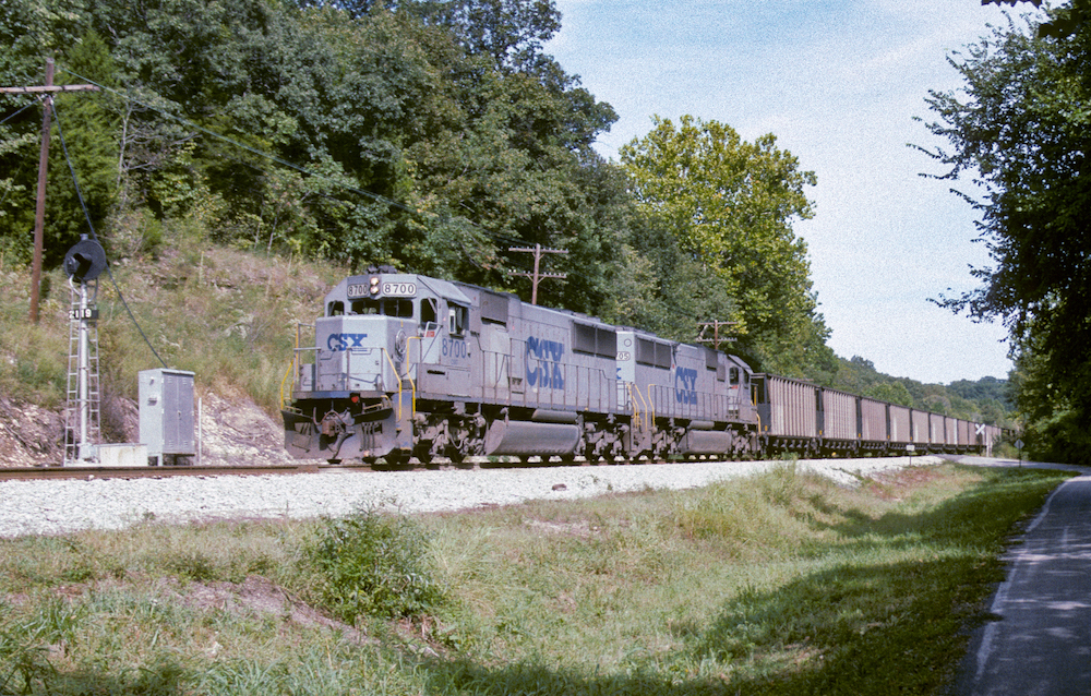
CSX’s gray and blue scheme from 1988 would become a stepping stone on the railroad’s journey to an attractive look for its locomotives. Called gray ghosts internally and stealth units by railfans, the solid gray from the frame up and blue below the frame was a cost-cutting measure from the initial CSX three-color design created in 1986. Concerns from the company’s claims department on visibility and a change in leadership at the top would morph this blah design into the very popular YN2 design that would adorn almost every locomotive in the fleet until YN3’s debut in 2002.
No. 2: Soo candy apple red
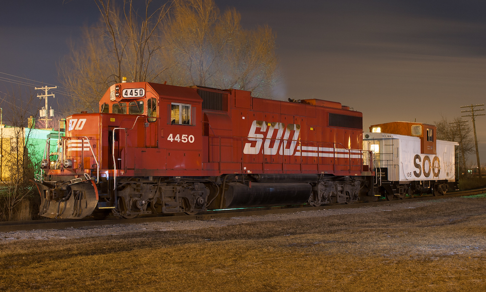
Soo Line’s classic gray and red scheme, first introduced in the early 1960s would come to an end in 1989 when management introduced the company’s new solid candy-apple-red scheme with more modern Soo lettering applied. Fortunately, this scheme would be short-lived, as CP Rail, who assumed full control of Soo Line in 1990, would introduce a new unified scheme for all its rail properties a few years after the new Soo Line design debuted.
No. 3: Burlington Northern’s executive scheme
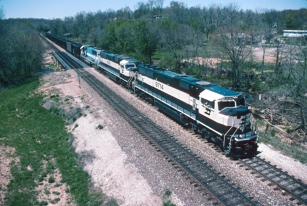
Burlington Northern took a bold step in 1990 when it brought in two F units from its maintenance of way to its West Burlington shop and made them into business train power. Less bold in many people’s opinion, including myself, was the cream and green colors they applied to the F units. It was a drastic departure from the railroad’s existing colors used since the railroad’s inception and would be applied to BN’s fleet of SD70MACs a few years later. Nicknamed Eddie Bauer’s after the outdoor company, the cream and green looked similar to many of the outfitter’s clothing items and the paint used on some special edition Eddie Bauer Ford vehicles beginning in the 1980s.
No. 4: BNSF 9647
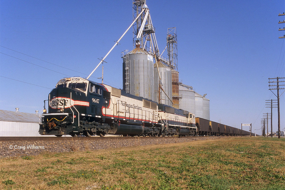
Shortly after the BNSF merger, the company began its search for the identity it would apply to the merged fleet of locomotives. It took a big swing and a miss with BNSF SD70MAC No. 9647 when it attempted to apply Burlington Northern’s cream and green colors to the Warbonnet design found on Santa Fe locomotives. Quickly nicknamed Barf Bonnet, the design would be the first of several design attempts by BNSF before settling on the orange and green colors that are far superior to the initial failed attempt.
No. 5: UP flag scheme
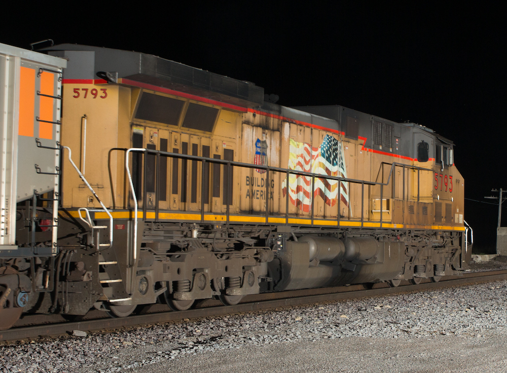
At the end of 2001, Union Pacific introduced a change to its locomotives with the addition of a waving flag and Building America slogan on the long hood of the locomotive. Unfortunately, the placement of the flag adjacent to the extremely hot prime mover inside caused many to become discolored, faded, or even burnt if an engine fire occurred. That coupled with the industry-wide trend to wash locomotives far less frequently often results in a heavy coat of dirt and grime over the flag. In the process, the corporate name was also relegated to the inside of the small UP shield, making it far less prominent on the massive road locomotives than before. In 2022, Union Pacific took action on employee feedback about poor flag conditions. The new design features a drastically reduced and relocated flag to the side of the nose on repainted locomotives and in the process, returning the Union Pacific lettering to its previous location on the long hood once again. I have an opinion about the wonderful wing logo that was removed when the flag was relocated, but I think that’s better left for another time.
Like this article? Read “Five locomotive paint schemes only a mother could love.”
Share this article