


Freight paint schemes
When public image was a big deal for railroads, many of them went out of their way to put together great looking freight locomotive paint schemes. Passenger locomotives were an obvious choice, but for many, just as much care went into a suitable freight scheme After all, a train stopping traffic at a grade crossing was a natural rolling billboard.
Let’s take a look at a few.
The Soo Line Railroad
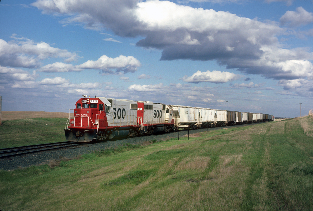
The ultimate consolidation of a number of railroad companies under the Canadian Pacific umbrella — operating primarily in Illinois, Wisconsin, Minnesota, as well as North and South Dakota — had for years a subtle maroon paint scheme for its locomotives. Their final paint scheme was Candy Apple Red and white with bold letters on the units’ flanks. Nobody could miss a Soo Line locomotive. Starting about 20 years ago, Soo began disappearing and its flashy paint scheme began disappearing into the mother company.
Great Northern Railway
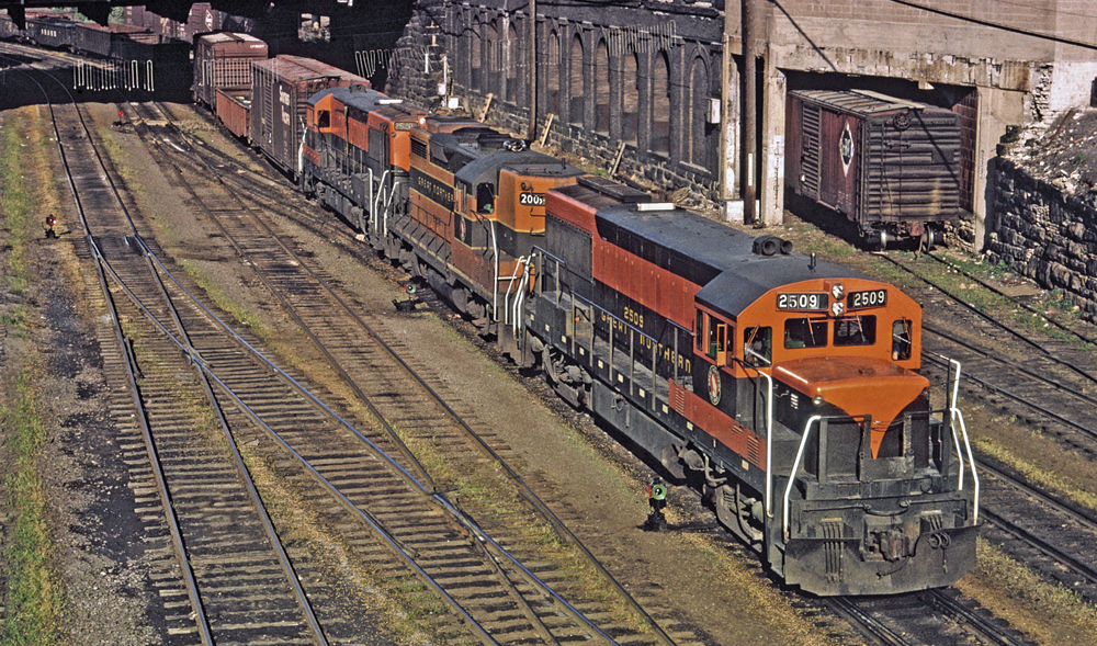
You would be hard pressed to find more traditional railroading locomotive colors than the green and orange of Great Northern. From the original, more complicated design to the simplified version, the design was distinctive, colorful, and instantly recognized by employees and civilians alike. Bringing the design to a crescendo was GN’s image of Rocky the Goat standing on a mountain peak. With much of the railroad’s main line traversing the many mountain ranges of the Pacific Northwest, it was very appropriate. It even looked good on the flatter eastern end of the system.
Northern Pacific Railway
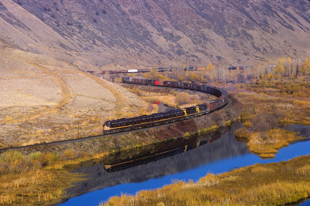
One of Great Northern’s archrivals was Northern Pacific, its main line roughly paralleling GN between Chicago and the west coast ports of Seattle and Portland.
Like Great Northern, visions of NP almost always are trains traversing vast areas of forests populated by an endless sea of pine trees. So, when designers needed to come up with a subtle but yet appropriate paint scheme, they came up with the “Pine Tree” paint scheme. Look carefully at the nose of that Northern Pacific F-unit. That’s a stylized pine tree guiding the crew on their route.
Chicago, Burlington & Quincy Railroad
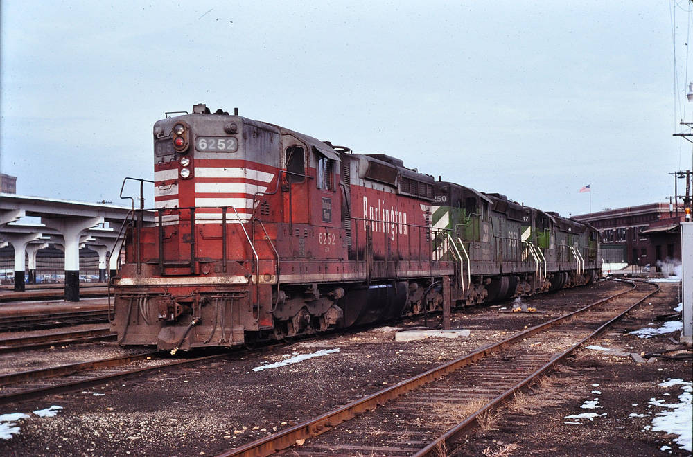
You want something as eye catching as Soo Line’s Candy Apple red and white? How about CB&Q’s Chinese Red? Units began coming out of the paint booth in red instead of the more traditional black the railroad applied to its road-switchers in the late 1950s and was applied to new locomotive orders as they came from the builders. A great billboard for the railroad.
Chicago, Rock Island & Pacific Railroad
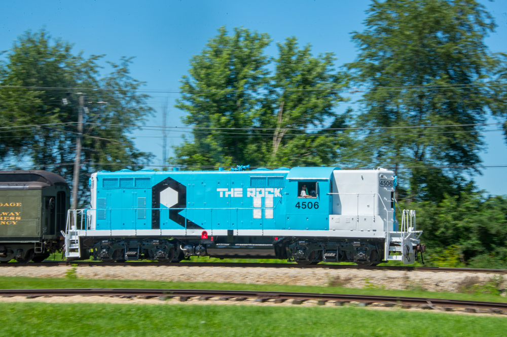
The Rock Island had a traditional but somewhat flashy black and red paint scheme on both its cab and road-switcher units for years. But while mired in bankruptcy in the 1970s, management had the idea that updating the locomotive paint scheme might help revitalize the company. This, Rock Island blue was born.
The flashy paint scheme, definitely not traditional railroad colors by any means, was meant to show the Rock was alive and well. While improvements were certainly made systemwide, it was generally considered too little, too late. By the time the Rock was divided up among other railroads, the blue and white scheme had been applied to a variety of EMD and GE road switchers and many of its switchers. Fans loved it or hated it, but nobody could ignore it.
Like this article? Check out “Classy passenger locomotive paint schemes from the 1940s to the 1980s.”

Great article. My father John F. Gould (1906-1996) had a 25 year illustrating and consulting career with GE Locomotive and Car Division at Erie, PA and Schenectady, NY. Check out http://www.johngouldart.com
Why no pictures?
I remember going to a model train store in the 70’s and 80’s and the color for Rock Island was Bankrupt Blue!
When my grandfather retired from the Rock in 1950 he said his reason was he couldn’t stand the smell of kerosene, after 45 years of running steam engines!
The pic of Rock #4506 looks like a model – so pristine and an H.O. style backdrop! I do recall (was in grad school @ U of Iowa @ the time), that newly repainted locos coming out of Silvis in nearby Quad Cities indeed looked like this i.e. model-like. Even repainted 40′ boxcars. The color was different but I have to believe it was NOT the normal brand of paint.
The Lackawanna/Erie Lackawanna Grey, Maroon, and Yellow was sharp and snazzy, whether on old F3s or the last SD45-2s, including NS 1700 and NS 1074.