


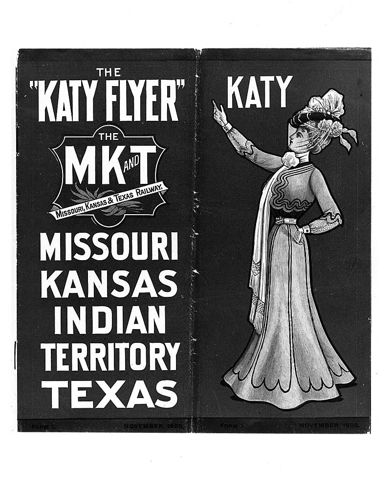
Missouri-Kansas-Texas logo underwent subtle changes throughout the railroad’s history. But its origin is more interesting than these iterative changes.
In his history of the Katy, J. Parker Lamb mentions the different incarnations of Katy’s corporate herald over the years, but where did the road’s uniquely shaped emblem come from? According to Freeman Hubbard in his 1945 classic Railroad Avenue, it originated during construction days when Katy felt it necessary to project a definite image in order to distance itself from firms exploiting Texas settlers.
This was still the “wild West,” remember, and so-called MK&T “land development companies” flourished, often “folding up like an accordion, without warning,” according to Hubbard. “‘Greasy spoon’ eating houses dignified themselves with the name of the railroad, and every fly-by-night outfit located on or near Katy property seemed to be masquerading as an MK&T concern.”
Officials at Katy’s headquarters, then in Sedalia, Mo., tired of explaining to victims of land sharks and other rip-off artists that the railroad wasn’t involved. They turned to Rand McNally & Co. of Chicago, which was then handling Katy advertising literature, to “design an emblem that would identify and distinguish the MK&T Railroad, its property, and its activities.” The design was similar to the popular and familiar latter-day emblem, with the palms behind the banner indicating that the road won the race into Native American Territory.
Hubbard pointed out that the emblem would be more than 50 years old before it was applied to freight locomotives, however.
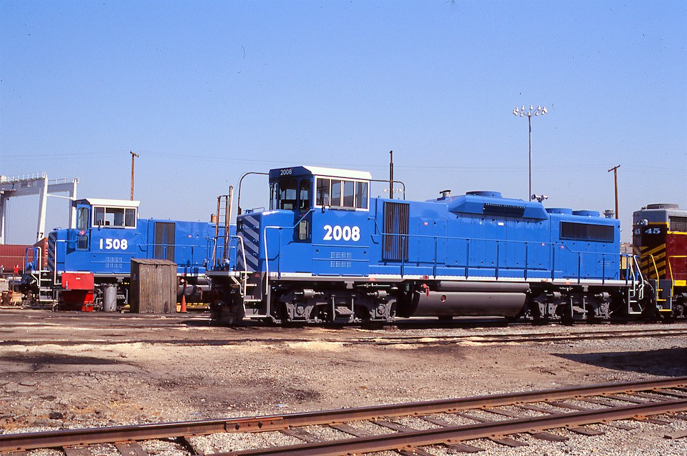
In the late 1970s, the Missouri-Kansas-Texas would transition to a green-and-yellow paint scheme reminiscent of John Deere and drop the familiar logo altogether. In 1988, the Union Pacific took over the Missouri-Kansas-Texas, but revived its image and a version of the red logo in 2006 for its fleet of “heritage” SD70ACe locomotives released that year.
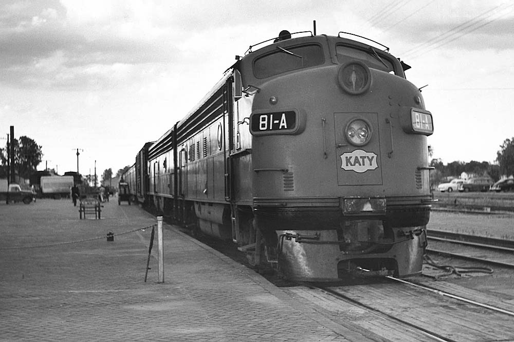

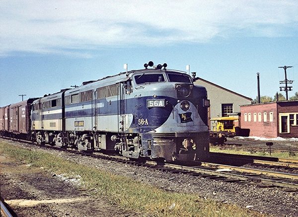


The simplified logo as shown in the 1960 photo came during the Deramus era in the late 1950s. John W. Barriger III brought back the traditional version when he took over in 1965.