Railroads & Locomotives Tom Danneman’s ideas for restyling BNSF

Tom Danneman’s ideas for restyling BNSF

By Angela Cotey | January 3, 2008

| Last updated on November 3, 2020

Get our weekly newsletter delivered to your inbox

Email Newsletter

Get the newest photos, videos, stories, and more from Trains.com brands. Sign-up for email today!

When Editor Wrinn mentioned his idea for an upcoming editorial (“BNSF, CSX, Please Buy a Vowel,”page 4, February 2008), I was in total agreement. I mentioned to him that since we were going ahead and renaming BNSF to Great Western, why don’t I fix their paint scheme while I’m at it. Jim thought that an illustration of a revised paint scheme would go great with the Editorial. I already had some ideas on how I could tweak their existing scheme. Maybe I should start by doing a little editorializing myself.
When BNSF was born in 1995, many people were anxiously awaiting a new logo and paint scheme. While many clamored for the Santa Fe’s Warbonnet paint scheme, I hoped for something new. After all, BNSF is an entirely new railroad that encompasses many predecessor railroads from all over the Midwest and Western U.S. The Warbonnet red and silver, admittedly one of the greatest images ever, was all about the Santa Fe, the Southwest, Native Americans, Route 66, etc., etc. Somehow it just doesn’t fit in the Cascades of Washington, or the plains of Eastern Montana. With that said, I was quite satisfied when the BNSF unveiled what is now known as the Heritage 1 paint scheme. Personally, I thought that BNSF had it right the first time. It incorporated the colors of many of the predecessor railroads, and even included a revised version of the circle and cross logo that was a take off of Santa Fe’s own. Later BNSF unveiled Heritage II paint with Santa Fe-style striping, yellow BNSF lettering on the hood, and a modified cigar band logo on the front. This just does not cut it for me. First, the lettering on the sides is completely lost from a distance. Second, the heavy striping adds nothing. In most cases, the cleaner the look, the better. Third, what happened to the circle and cross logo on the front? I could go on and on.
Back to the drawing board. While a brand new scheme for a railroad with a new name would be appropriate, I decided to just tweak BNSF’s existing paint scheme. Shown in Jim’s editorial and here as technical drawings, this is what I came up with. One version is of the scheme with a new name and logo, while the second is what BNSF could do to clean up their design without changing their existing logo. I greatly simplified the striping on the sides, and added a slight bend to the top stripe so it would meet the top of the roofline at the back of a cab. This is a design queue taken from BN’s Executive scheme applied on SD70MACs, as well as many other EMD-styled schemes of the past. The bottom yellow stripe is lower, which in turn allows more orange on the sides overall. I decided to apply “V” striping to the front end. I think this is appropriate, given that BN is a big part of BNSF, and you could say that the nose stripes harkens back to BN’s original scheme, as well as the tiger-stripe scheme of the mid 80’s. It doesn’t hurt for visibility either. On today’s BNSF new image scheme, the logo on the front is not very legible from a distance anyway, and leaves the face of the locomotives looking rather plain.

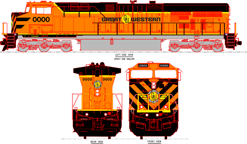
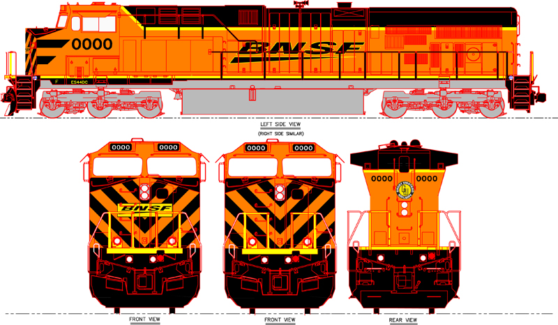
I designed the Great Western logo itself to mimic a style used by many railroads of the past. The circle with the wrapped type could be considered a take off from Great Northern or Northern Pacific, while the wings on the nose of the locomotive have a touch of Santa Fe’s head dress logo from the Warbonnet scheme. I think it has a pleasing retro look to it. Overall, the scheme incorporates many subtle touches of BNSF’s predecessors.

I’m no expert on what it costs to paint and decal a locomotive, but I would imagine that this version would cut the cost down to paint and letter a locomotive compared to BNSF’s existing new image scheme (at least the one applied to new or repainted comfort cab locomotives). This scheme would also work on virtually any locomotive on the roster. Not just the comfort cab locomotives. I’ve never understood the reasoning behind having two different schemes for the fleet. The argument could be made that the Santa Fe Super Fleet idea from the 90s was a good one. Santa Fe usually assigned (at least in the beginning) the Warbonnets to high priority intermodal trains. But now, BNSF doesn’t do that. The Heritage II and new images schemes can be seen on virtually any train in any place. This diminishes the exclusivity of having a scheme that is intended just for priority trains.

What do you think?

If you would like to comment on the forum, click here.

You must login to submit a comment