News & Reviews News Wire Amtrak unveils new locomotive paint scheme (corrected)

Amtrak unveils new locomotive paint scheme (corrected)

By David Lassen | April 15, 2022

| Last updated on March 18, 2024

'Phase VII' scheme will be worn by remainder of new ALC42 locomotives

Email Newsletter

Get the newest photos, videos, stories, and more from Trains.com brands. Sign-up for email today!

Locomotive with red, dark blue, and medium blue paint scheme
Siemens ALC42 No. 309 is the first locomotive to wear Amtrak’s “Phase VII” paint scheme. Amtrak/Mike Armstrong

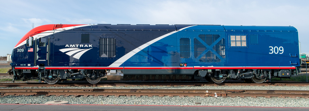
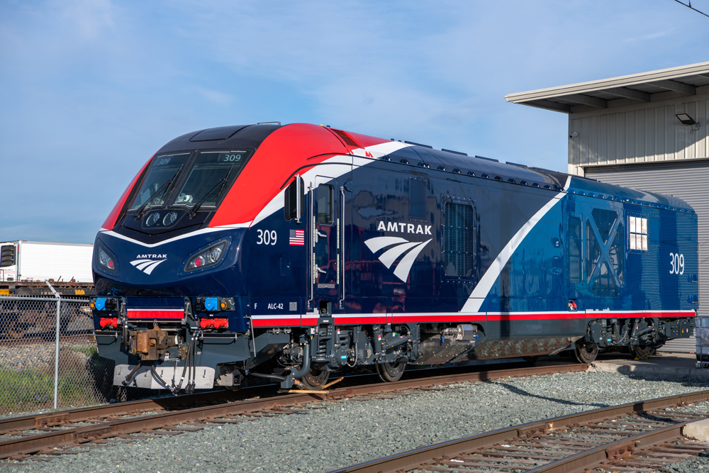
WASHINGTON — Amtrak has unveiled the new paint scheme to be worn by the remainder of its fleet of Siemens ALC42 locomotives, a two-tone blue design with a splash of red and white trim.

The “Phase VII” scheme — the seventh standard design in Amtrak’s 50-year history — debuts on Charger No. 309, the 10th of the 75 locomotives on order. It  is currently en route to Chicago after departing California on Thursday on the California Zephyr. It is scheduled to depart Chicago on Sunday on the Capitol Limited to Washington. It is on the way to Amtrak’s Wilmington, Del., shops where it will go through an acceptance process before entering service.

The white portions of the design are reflective for added visibility and safety, Amtrak says, with the white arcs separating the red and blue segments echoing the current Amtrak logo.

Amtrak CEO Stephen Gardner says in a press release that the new look “reflects the transformation underway at Amtrak as we welcome back our loyal customers while introducing new generations to rail travel.”

— Updated at 7 p.m. April 17 to correct Thursday departure from California rather than Friday. News Wire apologizes for the error.

Side view of red, dark blue, and medium blue locomotive
A broadside view of the new paint scheme (Amtrak/Mike Armstrong)

23 thoughts on “Amtrak unveils new locomotive paint scheme (corrected)

  1. Amtrak’s new “Phase VII” locomotive paint scheme is beautiful, bringing a cheerful appearance. However, there must be a lot visually impaired people out at night to require trains to wear reflective paint. Emergency and commercial road vehicles wear them also.

  2. The light shade of blue should be up front, and the darker shade to the rear. The locomotive looks “front heavy”……….

  3. Charles and Mark, the view from the cab is great if you are going forward on tangent track. The view to the side is bad and forget about opening windows, they do but they swing inward and on the engineer’s side it opens right over the control console. And they are like the GE’s, no separate HEP pony motor so if the prime mover goes down the whole train is without power and that’s all kinds of fun when you are in the San Joaquin valley in the summertime. I guess it would be better on the long hauls with more than one engine but these things are another shining example of Amtrak not being specific with the locomotive builder that is from and builds stuff mainly for Europe. The paint job is smoke and mirrors, the engines are junk. I am so glad I am retired and away from it.

    1. Gary, you do realize they use a Cummins QSK95 diesel engine in both the SC44 and ALC42, don’t you? Last time I looked, the Cummins was made right in here in the United States, not Europe, as a matter of fact Siemens North American is a completely separate subsidiary of Siemens, they took the design of a popular European engine and modified it for U.S. service, haven’t heard any complaints from Brightline or the state services that use the SC44 yet. Forward and the rear view mirrors should be sufficient for the purposes for which these are built. Also, the problem with the first unit wasn’t anything to do with the design…it entirely to do with the system for fuel additive to reduce emissions. Furthermore, Trains seems have forgotten that Amtrak already exercised the first option for additional ALC42’s on top of the original 75, I think that first option was for 50 so the total order is now 125 units.

  4. Would like to see the top red and white a bit wider to make it “burst”, otherwise it’s nice but a bit bland or dull. The blue on the back somehow just looks off. Just my opinion.

  5. All in all, a vast improvement over the dull dreary paint that has been Amtrak’s standard for the past 20 years. Now if only we could get rid of that meaningless logo……

    1. It’s not meaningless. It’s supposed to represent a train track going over the horizon.

  6. This does remind one of the Roger Lewis era at Amtrak – new color schemes, spiffy uniforms, etc. while the trains are dirty, toliets don’t work, etc.

  7. Question for people with T+E experience. Isn’t the view from the cab like totally restricted? Can’t see sideways, can’t see oblique, can only see front. Await your comments.

    Are there various cameras outside the locomtive with monitors in the cab for these views?

  8. It will be fascinating to see what the cars will look like, especially the Siemens trainsets.

  9. I really like the scheme in front, but the shade of blue in the rear does not seem to blend well with the front.

    1. Red, white, and blue, plus blue. Wonder what they will look like after a few thousand miles without a washing?

  10. I think I like Phase VI better with the lighter blue wrapped around the front but this is fine. Just stick with it and go to Phase III for all cars and try to keep everything uniform please.

  11. So typical of dysfunctional bureaucracies. The accent is on the optics, instead of focusing on its mission of serving the public with reliable transportation. The average non-rail fan traveler would rather have more options in travel routes/times with the reasonable expectation of arriving at his/her destination on time. The paint scheme is Phase Who-Gives-a-Damn as far as most riders are concerned.

  12. Amtrak spokesperson also noted that as pre-existing locomotives come due for major maintenance and/or repainting they will be receiving the Phase VII as well. This specific design was created to be applied and look aesthetically appealing on all “vehicle types.”
    He also made mention that will be unveiling railcar designs for Ph. 7 “later on.”

  13. Paint scheme looks nice but the Chargers are still on the ugly side. Hopefully some P42s will get the Phase 7 scheme too as I’m sure that not all P42s that will be around for a few more years have been overhauled yet.

  14. Given the far too numerous issues piling up on Gardner’s watch, such as ops, staffing, equipment, if only Amtrak had a functioning Board to provide the currently missing stewardship to demand “Dear Leader” focus on running a railroad; be less concerned with color design!

    1. BTW-Pathetic how Gardener’s focus is on the external surface of the engine when the power malfunctions fresh out of the Siemens plant, e.g., #7 “Empire Builder”–talk about “not seeing the forest from the trees…”

  15. Cute, sort of. I like the colors and the way the two blues balance each other. Looks good enough in the oblique view (top) but in the broadside view (bottom) the red looks like an afterthought, like an inadvertent paint spill. Seems to clash with the lines of the cab, rather than enhance those lines.

You must login to submit a comment