The birth of Classic Toy Trains magazine
I was hired as copy editor for both CTT and Model Railroader in February of 1988, just a few months after the premier issue of CTT hit newsstands in the autumn of the previous year.
To understand the origins of Classic Toy Trains, we need to turn our attention to the two men most responsible for its creation and immediate success: Editor Dick Christianson and Publisher Russ Larson. They recognized how the toy train hobby was blossoming in the late 1970s and early 1980s. and decided to start a magazine to serve the enthusiast community.
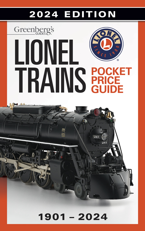
In my files, I’m sharing the original documents that eventually led to publishing Classic Toy Trains magazine. The text for these documents is shown below. While the premier issue is long sold out, you can still buy a PDF version in our store.


From a memo dated February 3, 1987
Written by Andy Sperandeo
We propose publication of a test issue for a new magazine, working title CLASSIC TOY TRAINS, subtitle For the Collector and Operator, to go on sale October 15, 1987. We further propose that a successful test lead to quarterly publication of CLASSIC TOY TRAINS, with the first quarterly issue on sale June 10, 1988. This proposal grew out an idea by Dick Christianson, introduced to the product development committee by Fred Hamilton.
The primary audience for CLASSIC TOY TRAINS would be affluent adult males interested in collecting and operating tinplate and toy trains. Their main area of interest is Lionel O gauge trains of all vintages including current production, but they are also interested in any collectible toy trains in s, o, and larger gauges. Specifically, today’s LGB trains would be included, as would Delton and Kalamazoo G scale trains.
The potential size of this audience can be estimated at around 45,000, based on MR’s 1983 reader survey. That is, that many MR readers responded positively to a question asking if they had some interest in antique toy trains. In the same survey, 7000 readers listed o gauge tinplate as their primary modeling interest, and for another 4000 respondents their primary interest was G scale. While we have no figures to prove it, MR’s editorial staff believes that interest in G scale has increased markedly since the 1983 survey.
Another measure of this audience is membership in national organizations: 4,200 in the Toy Train Operating Society (TTOS), 5,000 in the Lionel Collector’s Club of America (LCCA), and 18,000 in the Train Collector’s Association (TCA). TCA membership has more than doubled in the last ten years, which suggests that this is a growing market. A partial check of the TCA list shows that only 8 percent are current MR subscribers, suggesting that most of them are not readers we already have.
There is no commercial magazine currently serving this market, so CLASSIC TOY TRAINS represents an opportunity for Kalmbach to both capture the audience and participate in its growth. The audience seems to demand a slick, colorful magazine, but should therefore support a high cover price–we propose $3.95. Circulation would be heavily weighted towards subscribers, and this should minimize the effects of single-copy sales resistance to the cover price.
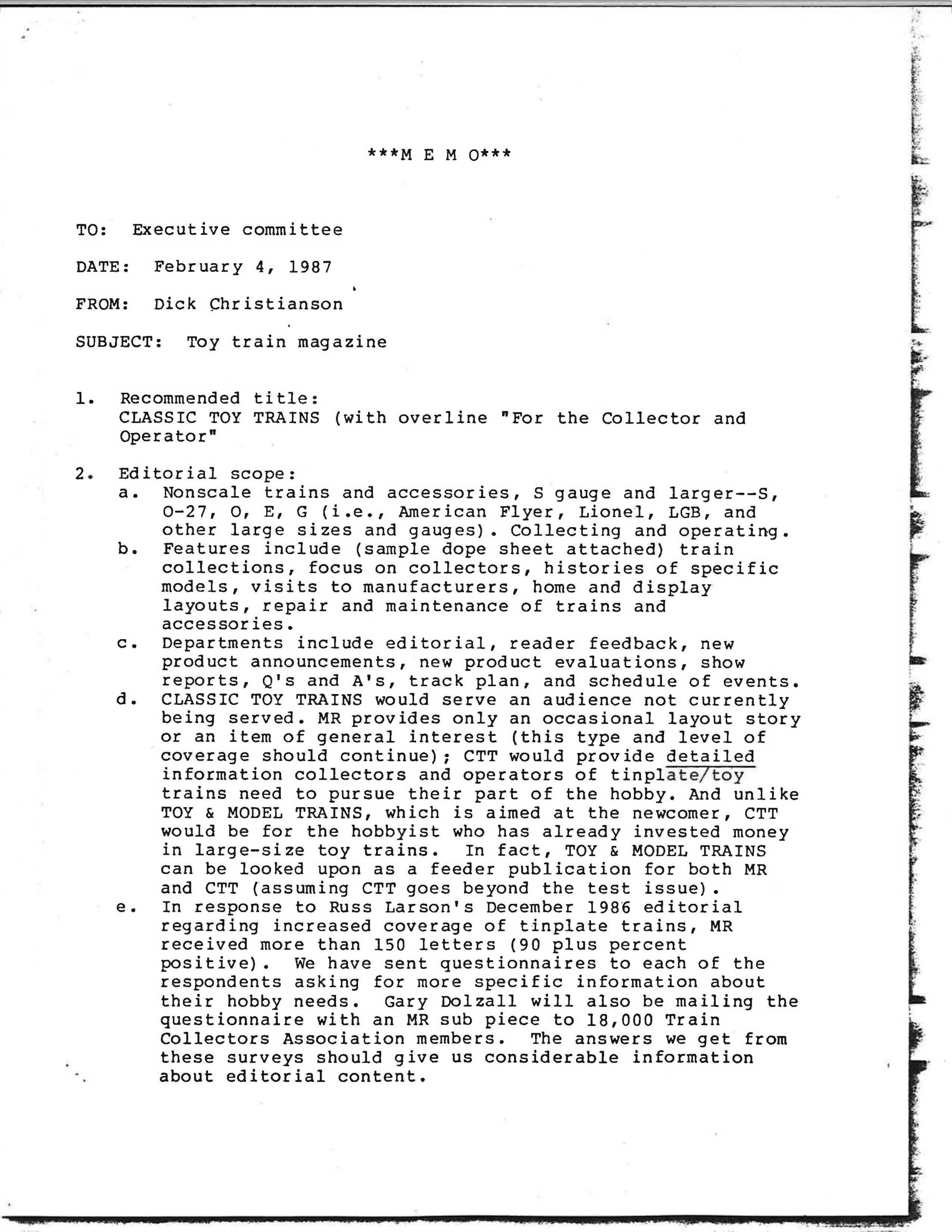
From a memo dated February 4, 1987
Written by Dick Christianson
- Recommended title: CLASSIC TOY TRAINS (with overline “For the Collector and Operator”)
- Editorial scope:
- Nonscale trains and accessories, S gauge and larger–S, 27, O, E, G (i.e., American Flyer, Lionel, LGB, and other large sizes and gauges). Collecting and operating.
- Features include (sample dope sheet attached) train collections, focus on collectors, histories of specific models, visits to manufacturers, home and display layouts, repair and maintenance of trains and accessories.
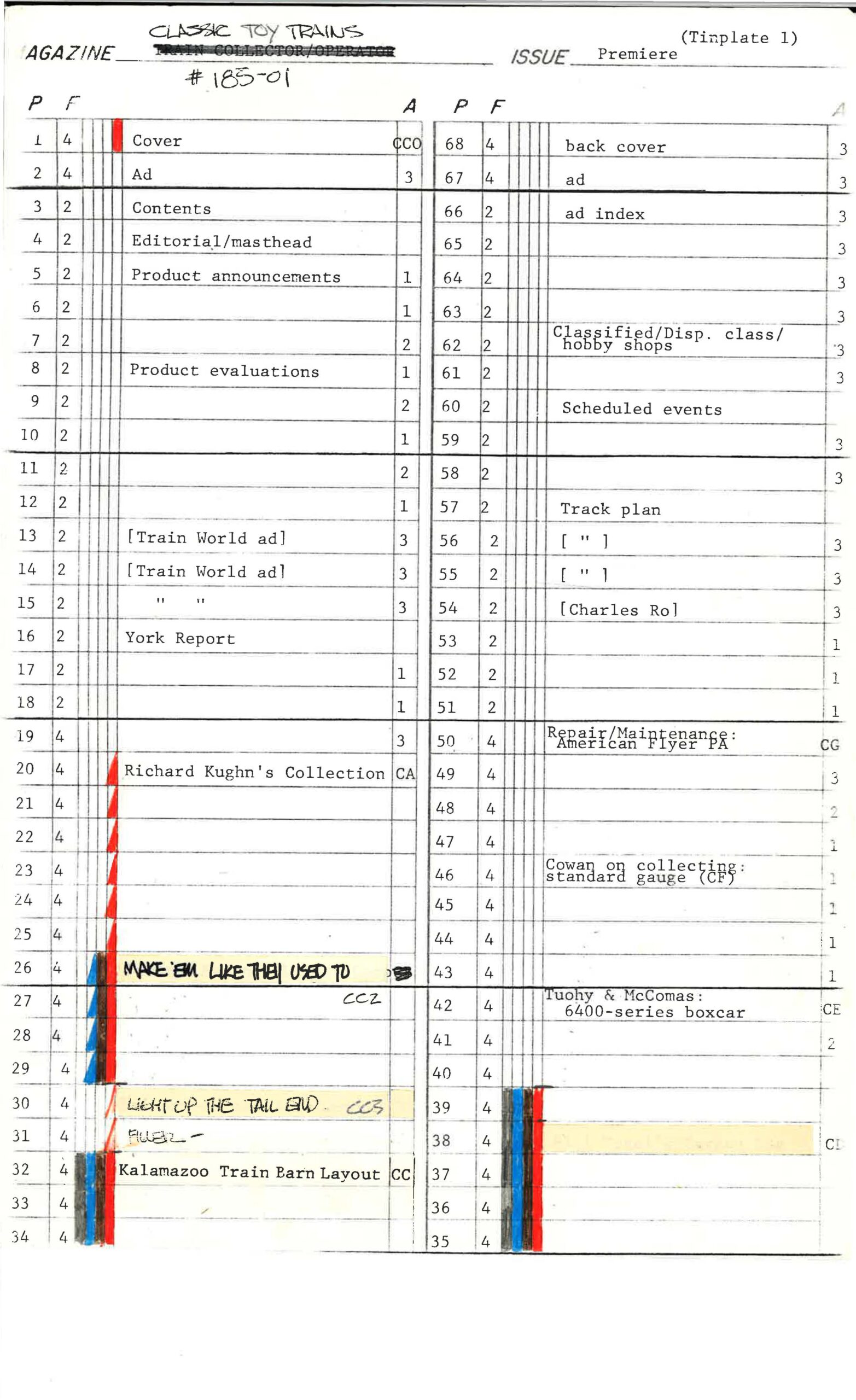
- Departments include editorial, reader feedback, new product announcements, new product evaluations, show reports, Q’s and A’s, track plan, and schedule of events.
- CLASSIC TOY TRAINS would serve an audience not currently being served. MR provides only an occasional layout story or an item of general interest (this type and level of coverage should continue); CTT would provide detailed information collectors and operators of tinplate/toy trains need to pursue their part of the hobby. And unlike TOY & MODEL TRAINS, which is aimed at the newcomer, CTT would be for the hobbyist who has already invested money in large-size toy trains. In fact, TOY & MODEL TRAINS can be looked upon as a feeder publication for both MR and CTT (assuming CTT goes beyond the test issue).
- In response to Russ Larson’s December 1986 editorial regarding increased coverage of tinplate trains, MR received more than 150 letters (90 plus percent positive). We have sent questionnaires to each of the respondents asking for more specific information about their hobby needs. Gary Dolzall will also be mailing the questionnaire with an MR sub piece to 18,000 Train Collectors Association members. The answers we get from these surveys should give us considerable information about editorial content,
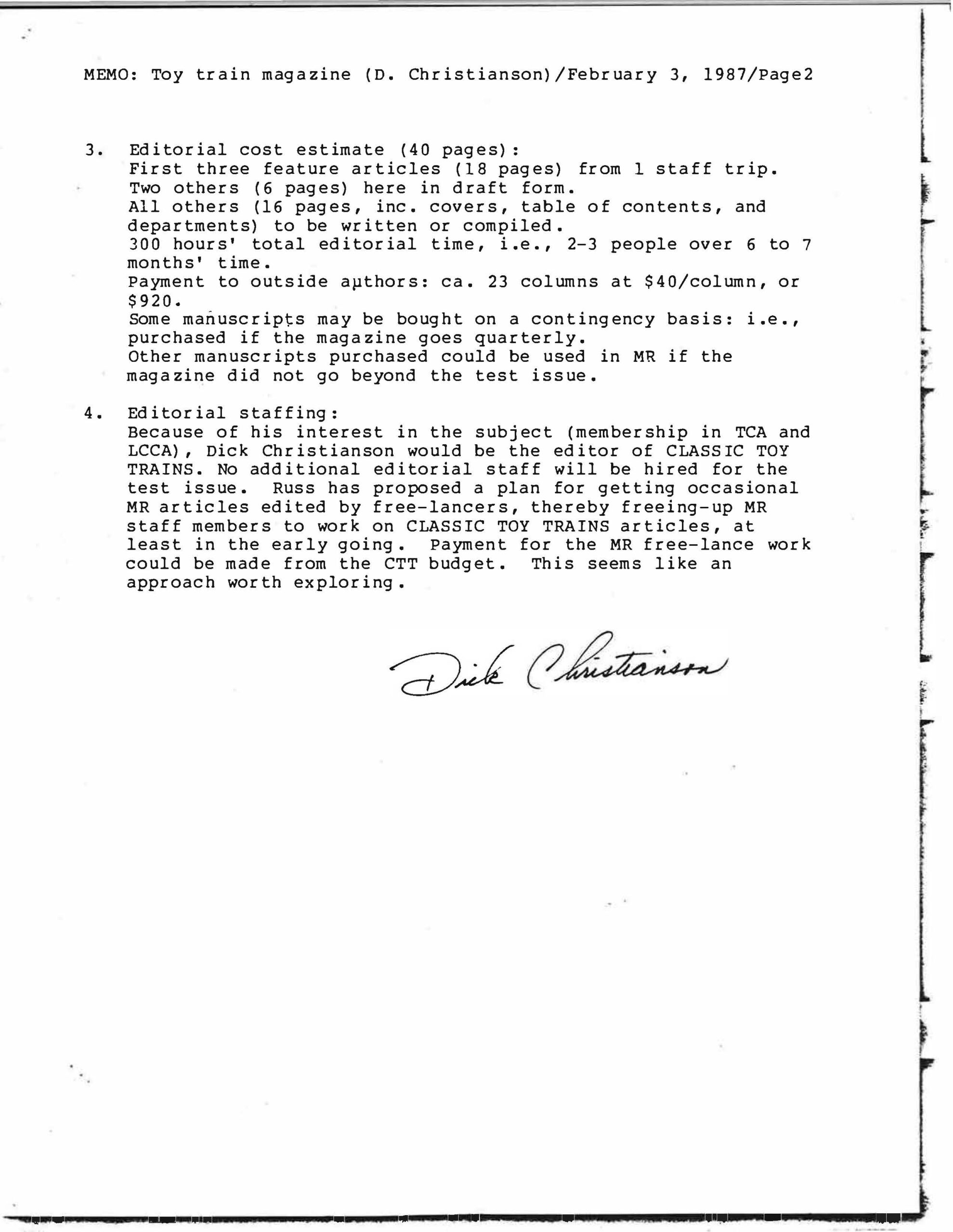
- Editorial cost estimate (40 pages):
First three feature articles (18 pages) from 1 staff trip. Two others (6 pages) here in draft form.
All others (16 pages, inc. covers, table of contents, and departments) to be written or compiled.
300 hours’ total editorial time, i.e., 2-3 people over 6 to 7 months’ time.
Payment to outside aµthors: ca. 23 columns at $40/column, or$920.
Some manuscripts may be bought on a contingency basis: i.e., purchased if the magazine goes quarterly.
Other manuscripts purchased could be used in MR if the magazine did not go beyond the test issue.
Editorial staffing:
Because of his interest in the subject (membership in TCA and LCCA), Dick Christianson would be the editor of CLASSIC TOY TRAINS. No additional editorial staff will be hired for the test issue. Russ has proposed a plan for getting occasional MR articles edited by free-lancers, thereby freeing-up MR staff members to work on CLASSIC TOY TRAINS articles, at least in the early going. Payment for the MR freelance work could be made from the CTT budget. This seems like an approach worth exploring.
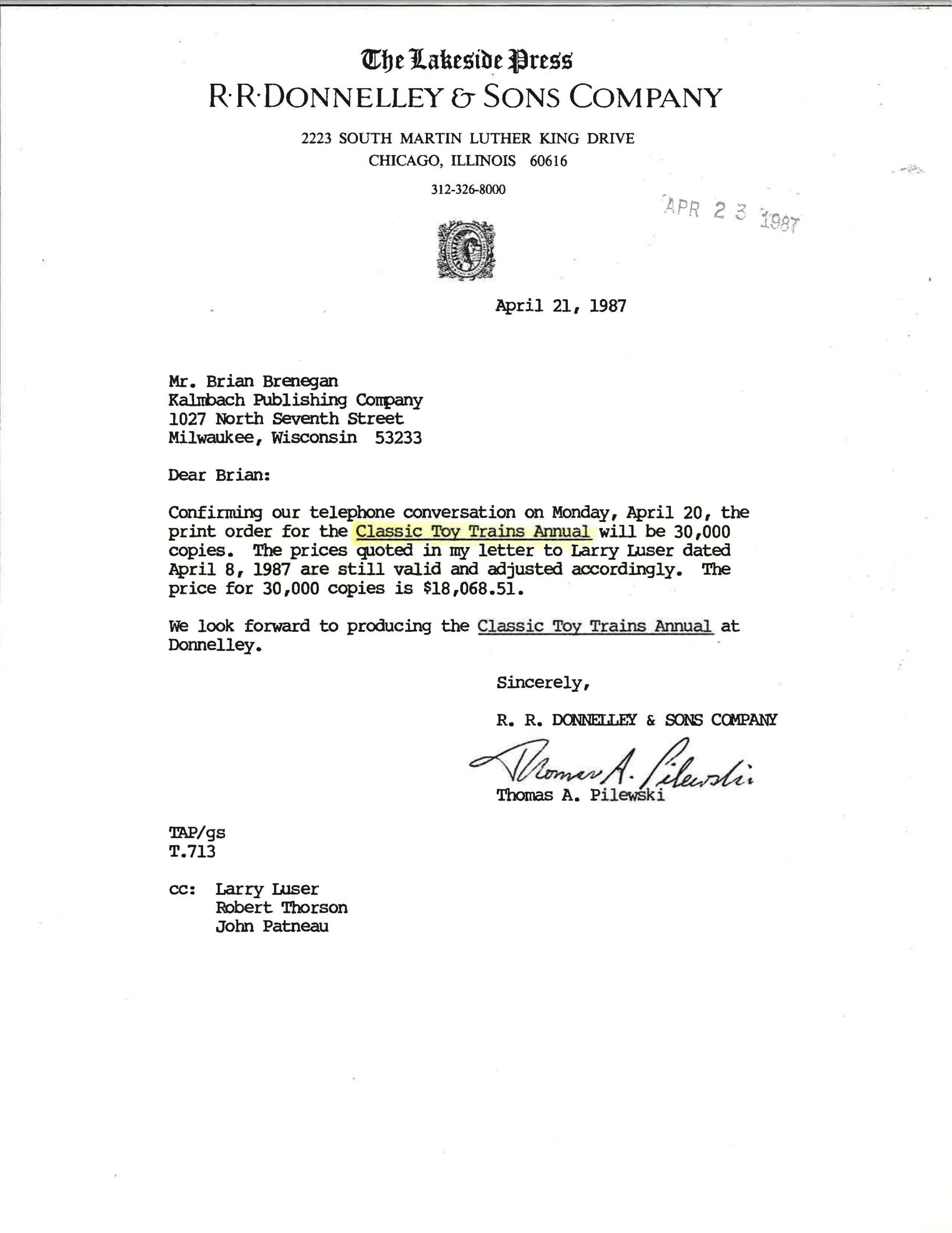
From a memo dated April 21, 1987
Written by printers R.R. Donnelley & Sons
Mr. Brian Brenegan
Kalnbach Publishing Company
1027 North Seventh Street
Milwaukee, Wisconsin 53233
Dear Brian:
Confirming our telephone conversation on Monday, April 20, the print order for the Classic Toy Trains Annual will be 30,000 copies. The prices quoted in my letter to Larry Luser dated April 8, 1987 are still valid and adjusted accordingly. The price for 30,000 copies is $18,068.51.
We look forward to producing the Classic Toy Trains Annual at Donnelley.
Sincerely,
Thomas A. Pilewski
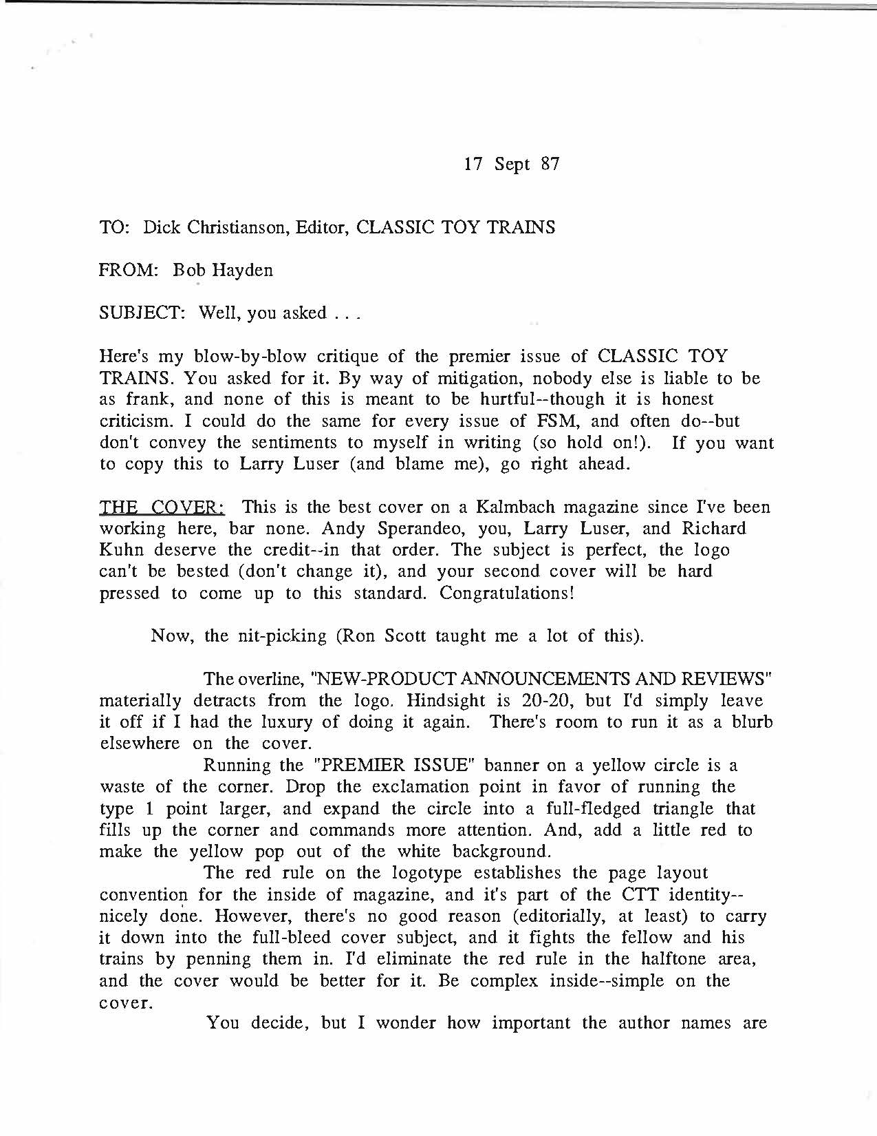
From a memo dated September 17, 1987
Written by Bob Hayden, then editor of Finescale Modeler (FSM)
Here’s my blow-by-blow critique of the premier issue of CLASSIC TOY TRAINS. You asked for it. By way of mitigation, nobody else is liable to be as frank, and none of this is meant to be hurtful–though it is honest criticism. I could do the same for every issue of FSM, and often do–but don’t convey the sentiments to myself in writing (so hold on!). If you want to copy this to Larry Luser (and blame me), go right ahead.
THE COVER: This is the best cover on a Kalmbach magazine since I’ve been working here, bar none. Andy Sperandeo, you, Larry Luser, and Richard Kuhn deserve the credit–in that order. The subject is perfect, the logo can’t be bested (don’t change it), and your second cover will be hard pressed to come up to this standard. Congratulations!
The overline, “NEW-PRODUCT ANNOUNCEMENTS AND REVIEWS” materially detracts from the logo. Hindsight is 20-20, but I’d simply leave it off if I had the luxury of doing it again. There’s room to run it as a blurb elsewhere on the cover.
Running the “PREMIER ISSUE” banner on a yellow circle is a waste of the corner. Drop the exclamation point in favor of running the type 1 point larger, and expand the circle into a full-fledged triangle that fills up the corner and commands more attention. And, add a little red to make the yellow pop out of the white background.
The red rule on the logotype establishes the page layout convention for the inside of magazine, and it’s part of the CTT identity-nicely done. However, there’s no good reason (editorially, at least) to carry it down into the full-bleed cover subject, and it fights the fellow and his trains by penning them in. I’d eliminate the red rule in the halftone area, and the cover would be better for it. Be complex inside–simple on the cover.
You decide, but I wonder how important the author names are for the potential readers of this magazine. Do “Hollander” and “Tuohy & McComas” push the hot buttons, or are the grabbers “The Story of Lionel Smoke” and “Six Great Toy Train Layouts”? I tried this with FSM, and decided that the subject matter is more general and more compelling that the author. (I think this is our common failing as editors, because we deal one-on-one with the authors, but as the “generalized other” with readers. It probably ought to be the other way around.)
Might it be better to make the type 1/2 point bigger and make the blurb read “RICHARD KUHN, Mr. Lionel” and leave out “and his collection?” His collection is pretty damned obvious in the photo.
PAGE 3: The contents page ought to be on page three, unless somebody is willing to pay you so much advertising money that you can’t stand it. I figure that, after the cover and the centerspread, it’s our third chance to sell the magazine to the casual picker-upper at the newsstand or hobby shop. Otherwise, it looks great. I’d fall back on the old magazine dictum that the cover lines ought to appear, verbatim, on the TOC, and then on the article. Just for the heck of it, and because you have red available, I’d also run the “K” logo in red.
EDITORIAL: It’s a little far forward in the magazine for my tastes. Are the readers ready for another heavy dose of “here’s what we’re showing you” this soon after the TOC? Also think about running “Next Issue” as the 1/3 page with the editorial–to my mind, it’s kind of like “If you don’t like what we’ve got for you this time, here’s what we’ll send you next time.”
PRODUCT NEWS: Full spreads of six editorial columns are not the way to handle this material. Yes, it’s important–but take a look at the 2-column format we use for FSM Workbench Reviews as a way to make it the mostimportant editorial department without making it a feature. What you have here is too rich for the readers and detracts from the full-fledged feature stuff that comes later.
CTT PRODUCT REVIEWS: Page 11 is an excellent lead, though the lineup photo of the F40s should be deeper and more prominent–maybe full page wide at the bottom of the review. There ought to be a jump line to take the reader to page 14–a full spread of ads is too far to expect the reader to jump without help. Ditto for the jump to page 18.
FEATURES: The captions are too small, and the italic face makes it worse. (Italic is harder to read than the same size Roman.) Make them at least a point size bigger, and you ought to experiment with simply usmg the Roman face at that size.
Page 23–how about putting “Photos by Andy Sperandeo” outside the rule that establishes the non-bleed limit of the editorial page? This would make the credit a “footnote,” but in a way make it more prominent for those readers who care. (I’m all for giving due credit, and Andy took super photos, but he gets a Kalmbach paycheck every week.)
Page 23–the “decks,” those pulled-out quotes, are super, and entirely appropriate for this article structure. Just don’t be fooled into using them for articles where they don’t fit–I see a lot of that in other magazines these days.
Page 26–If you’re going to use the Lionel Logo, use it about twice this big. And you could have also used it (at little expense) on pages 23 and 25, as a continuity factor.
Page 27–1 bet you could have gotten away with putting “©1987 TM Books” outside the hairline at the foot of the page. Would have caused less of a reader lurch there, I’d say. Also, the symbol or the word “Copyright” serve the same purpose–the law asks for one or the other, not both.
Page 40.–I can read these captions. So can your readers.
Pages 46-4 7. The ads read as part of the editorial matter. You and Larry need to talk about this.
That’s all, folks. It looks a far-sight better than the first FSM, and I don’t mind admitting that. If I have any wisdom at all to pass along, I proffer only that you have to remember you’re building this magazine for three groups of individuals: 1. The Readers. 2. The Readers. 3. The Readers. Satisfy them, and if there are enough of them, you’ll be giving me advice before both of us know it!